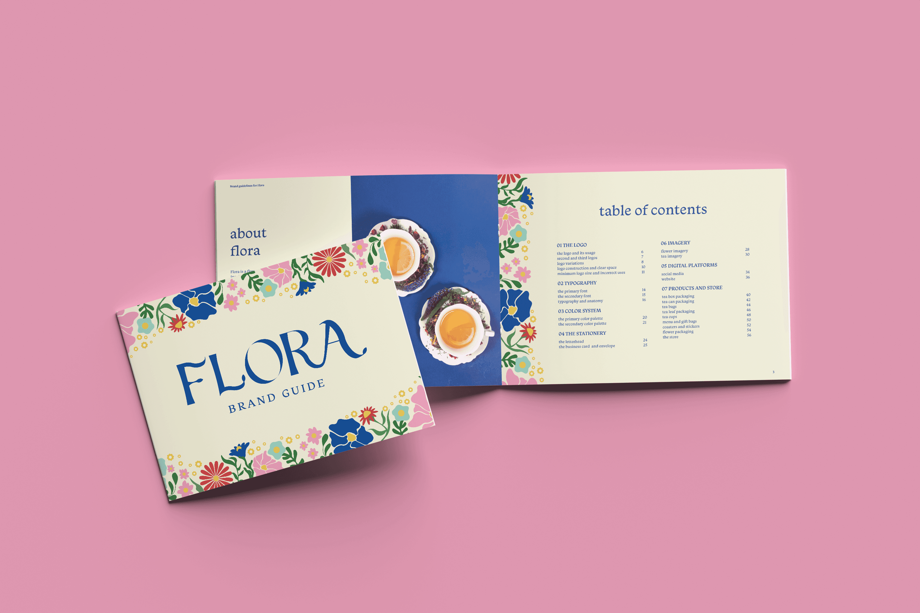
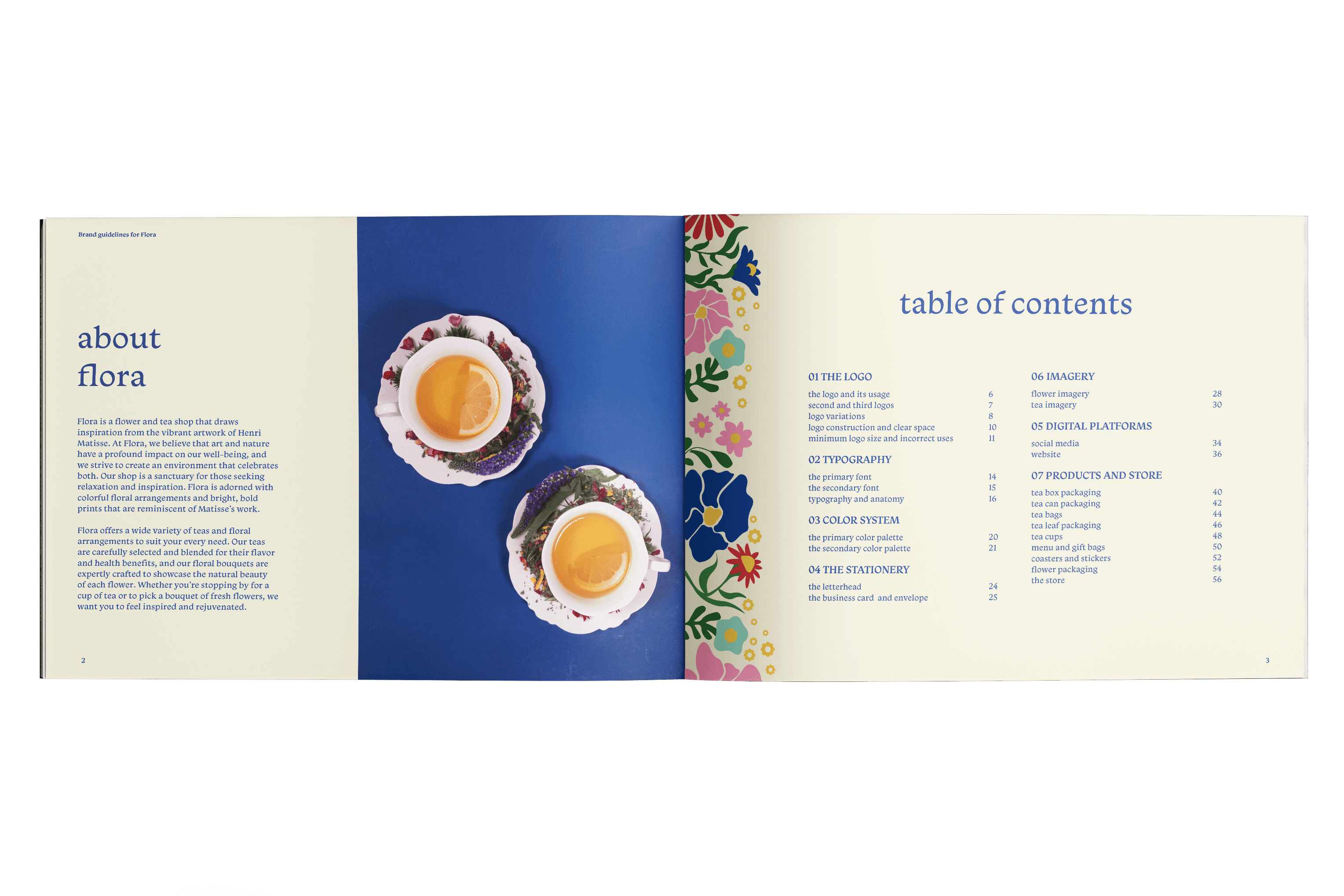
FLORA
A full brand identity project for Flora, a flower and tea shop inspired by the vibrant artwork of Henri Matisse. Every creative asset was developed from scratch to reflect Flora’s mission of blending art, nature, and well-being into a cohesive and inviting customer experience.
CLIENT
Self
Industry
Food & Beverage
SERVICE
Brand Identity
Package Design
Photo
Video
DURATION
4 Months
CLIENT
Self
Industry
Food & Beverage
SERVICE
Brand Identity
Package Design
Photo
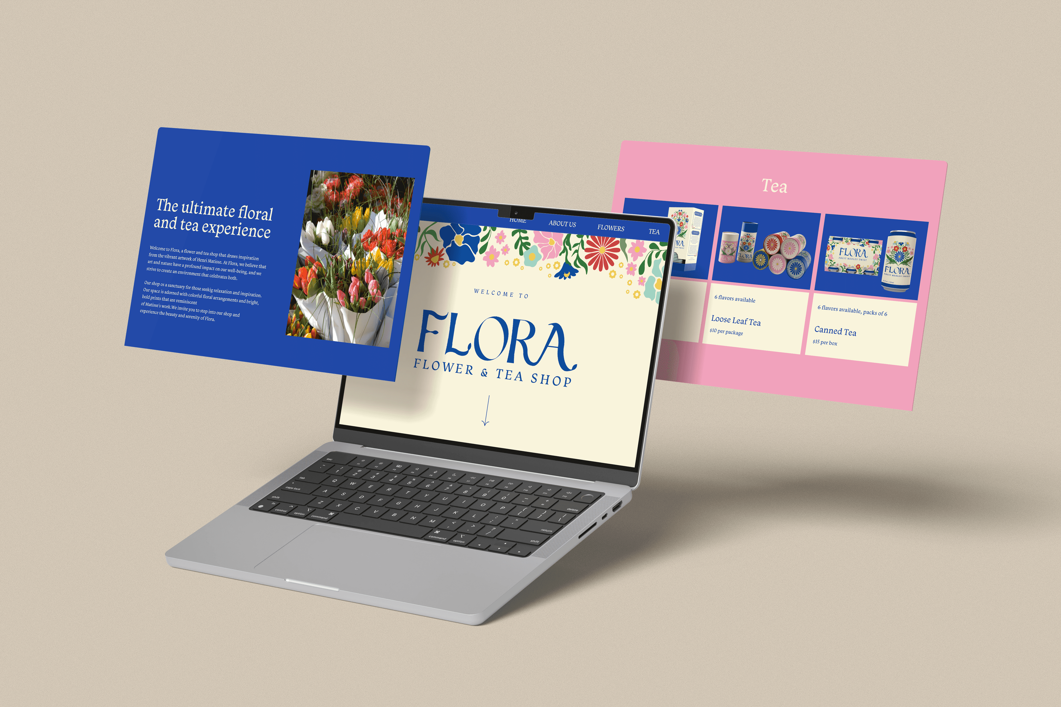
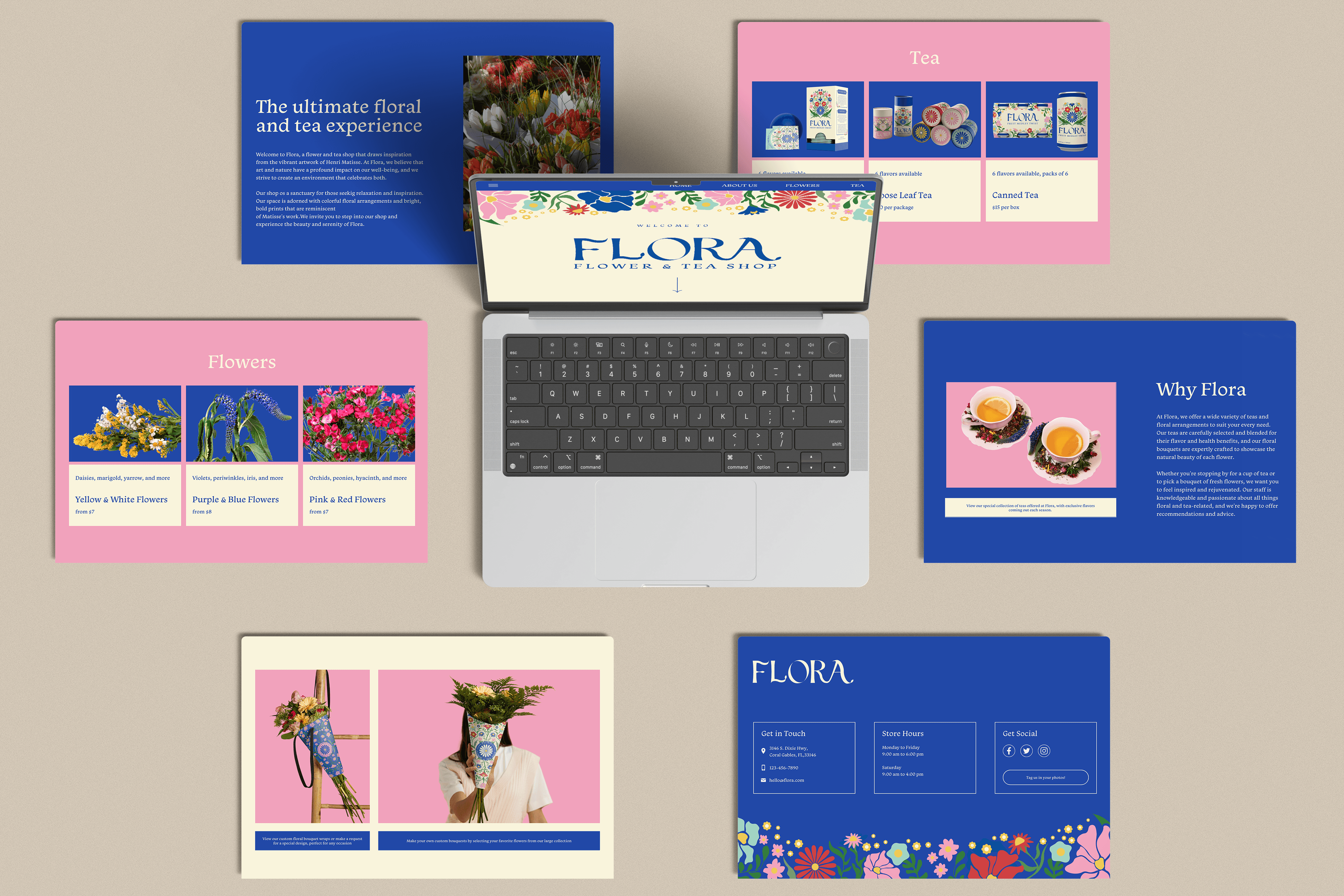
Web Development
Video
DURATION
4 Months
OverView
OverView
OverView
OverView
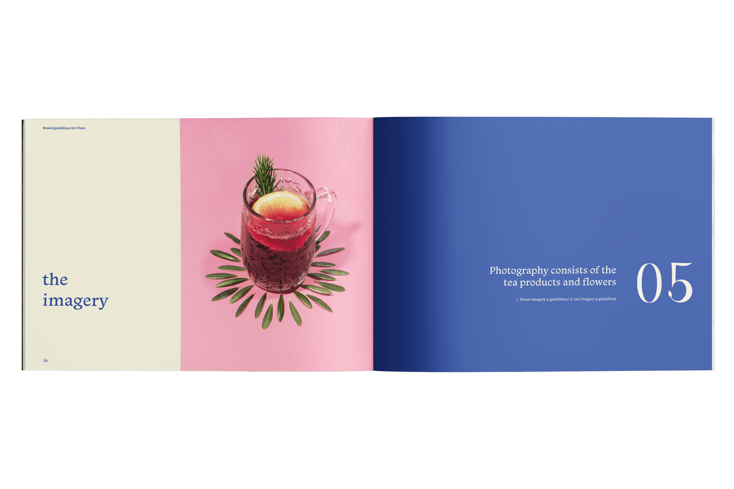
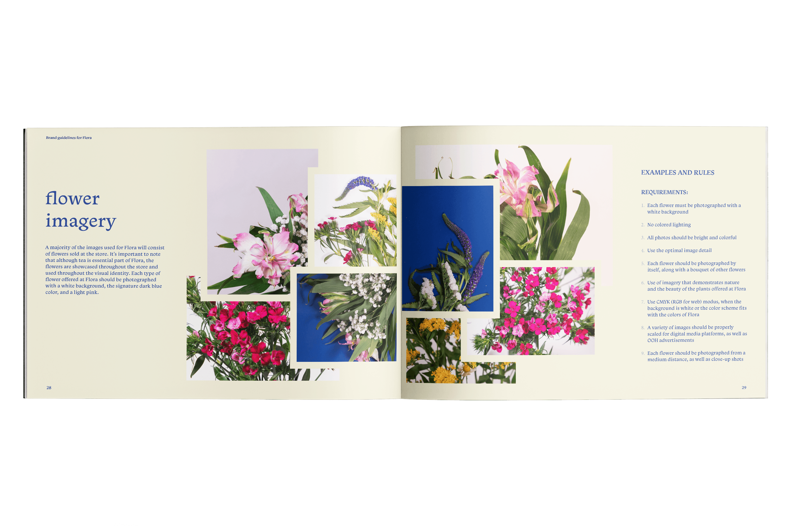
Flora is a flower and tea shop inspired by the art of Henri Matisse, designed as a vibrant and calming space for enjoying curated teas and floral arrangements. As the sole creative, I developed the entire brand including visual identity, packaging, product design, and social media strategy, creating an immersive experience centered on wellness and creativity.
Flora is a flower and tea shop inspired by the art of Henri Matisse, designed as a vibrant and calming space for enjoying curated teas and floral arrangements. As the sole creative, I developed the entire brand including visual identity, packaging, product design, and social media strategy, creating an immersive experience centered on wellness and creativity.
The Challenge
The Challenge
The Challenge
The Challenge
With no existing brand identity, Flora required a complete design from scratch. The challenge was to create a visual style that reflected Matisse’s whimsy while maintaining functionality and refinement, conveying warmth, elegance, and artistic purpose across all products and channels.
With no existing brand identity, Flora required a complete design from scratch. The challenge was to create a visual style that reflected Matisse’s whimsy while maintaining functionality and refinement, conveying warmth, elegance, and artistic purpose across all products and channels.
The Solution
The Solution
The Solution
The Solution
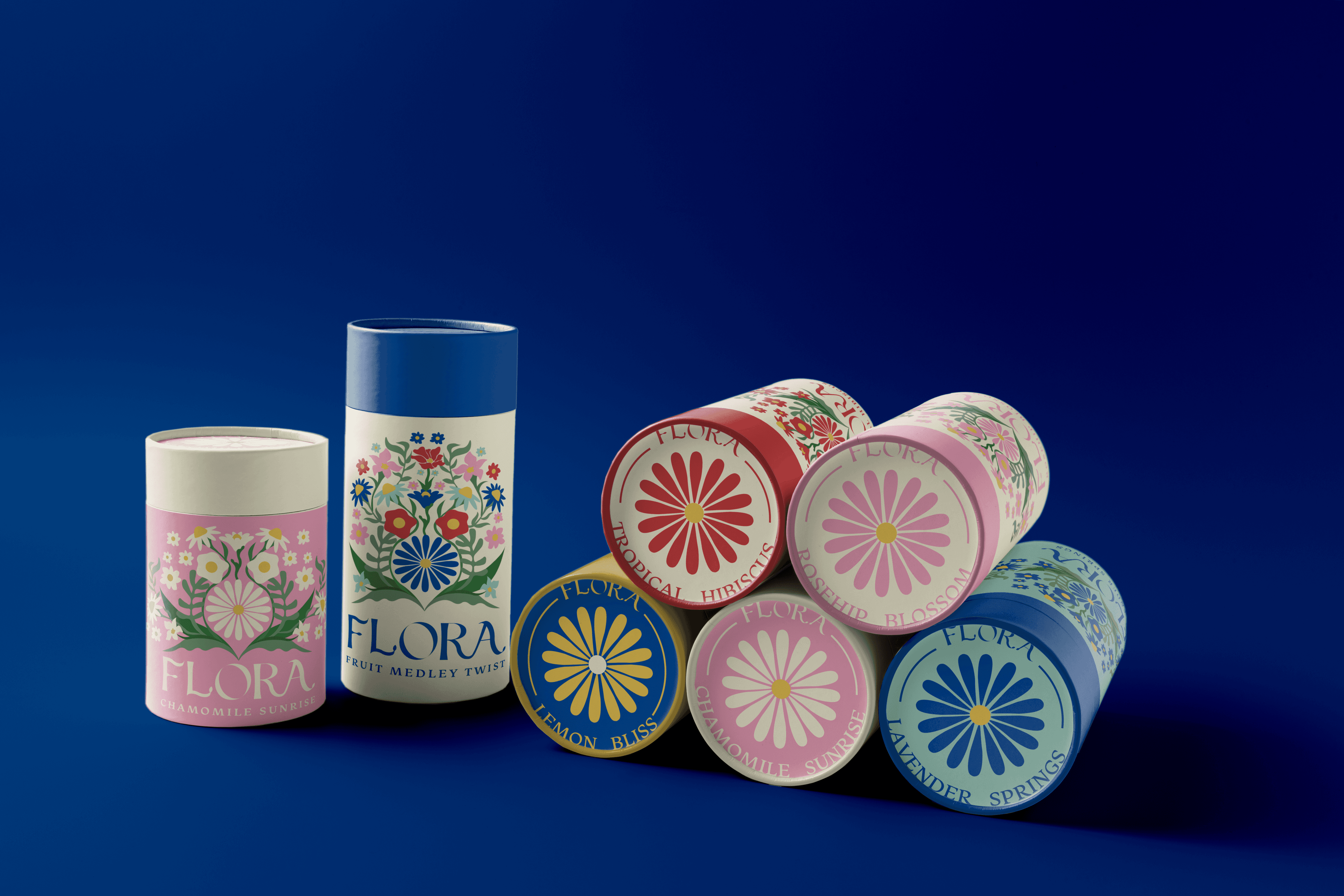
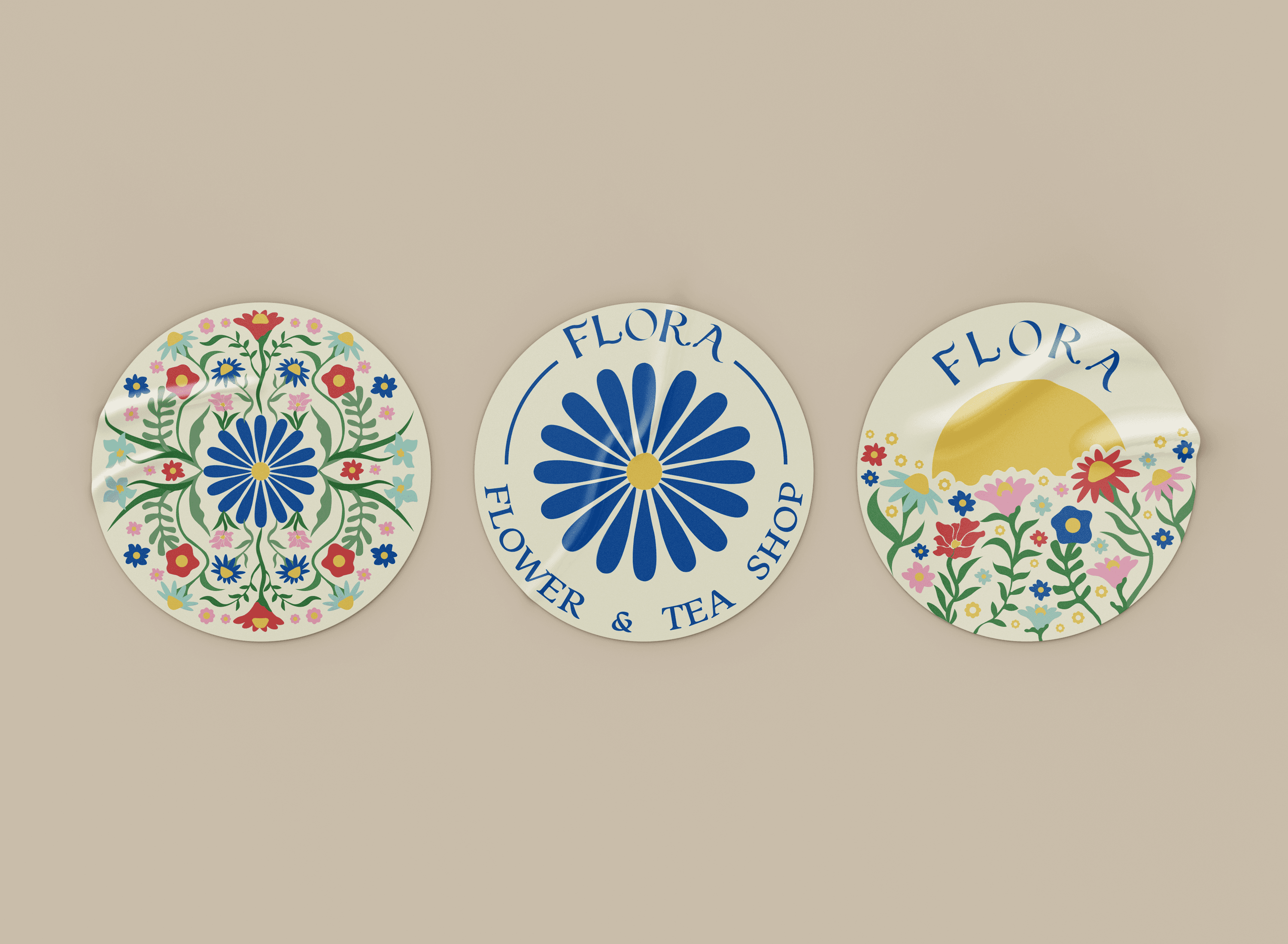
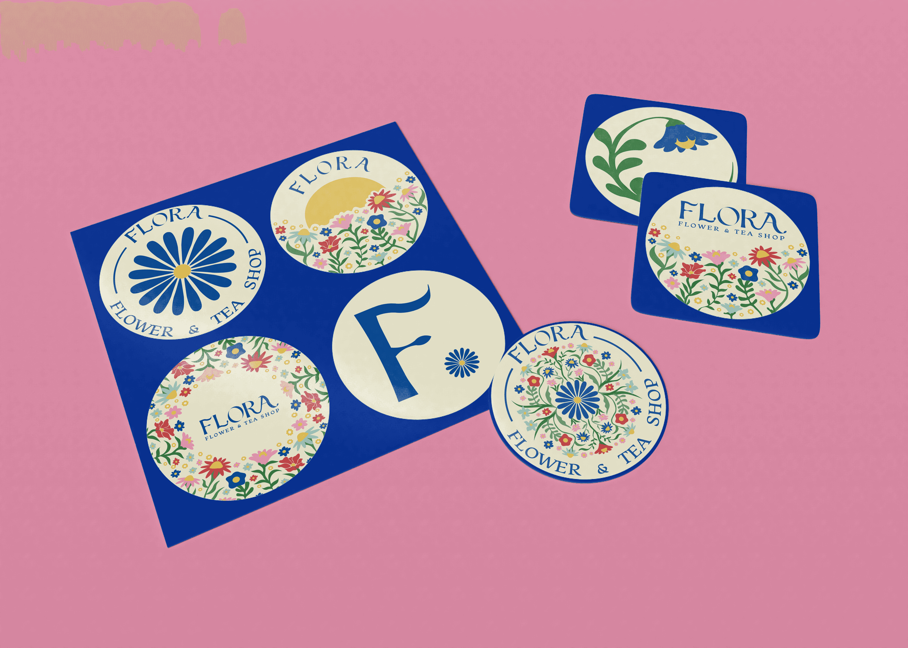
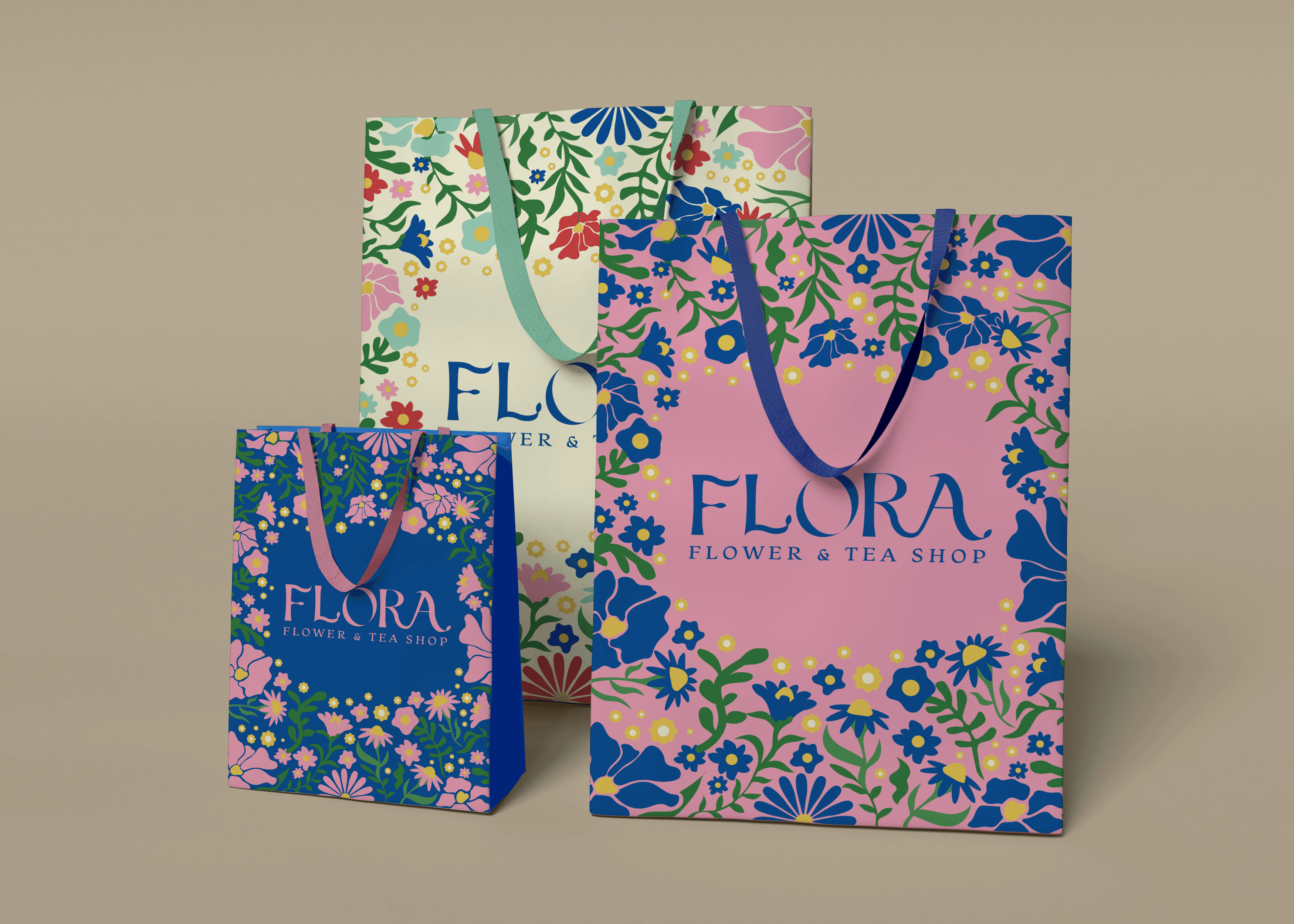
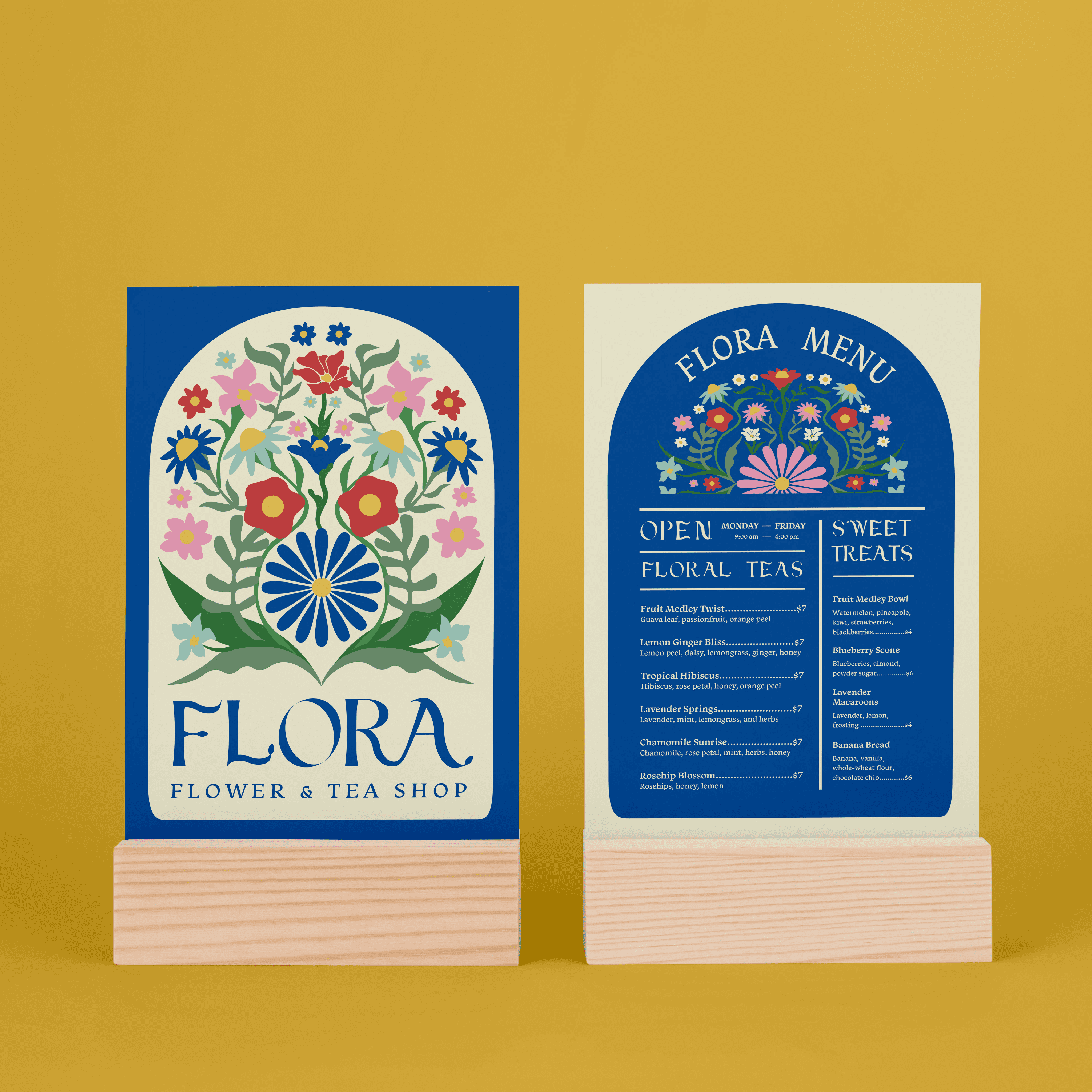
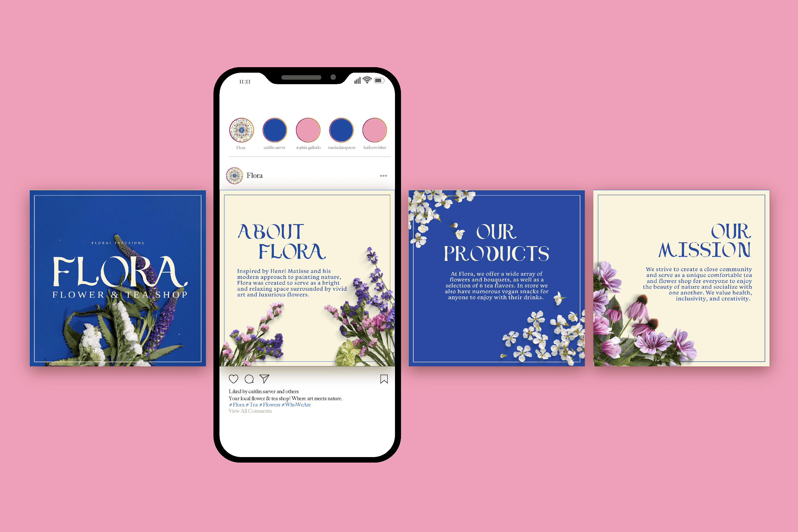
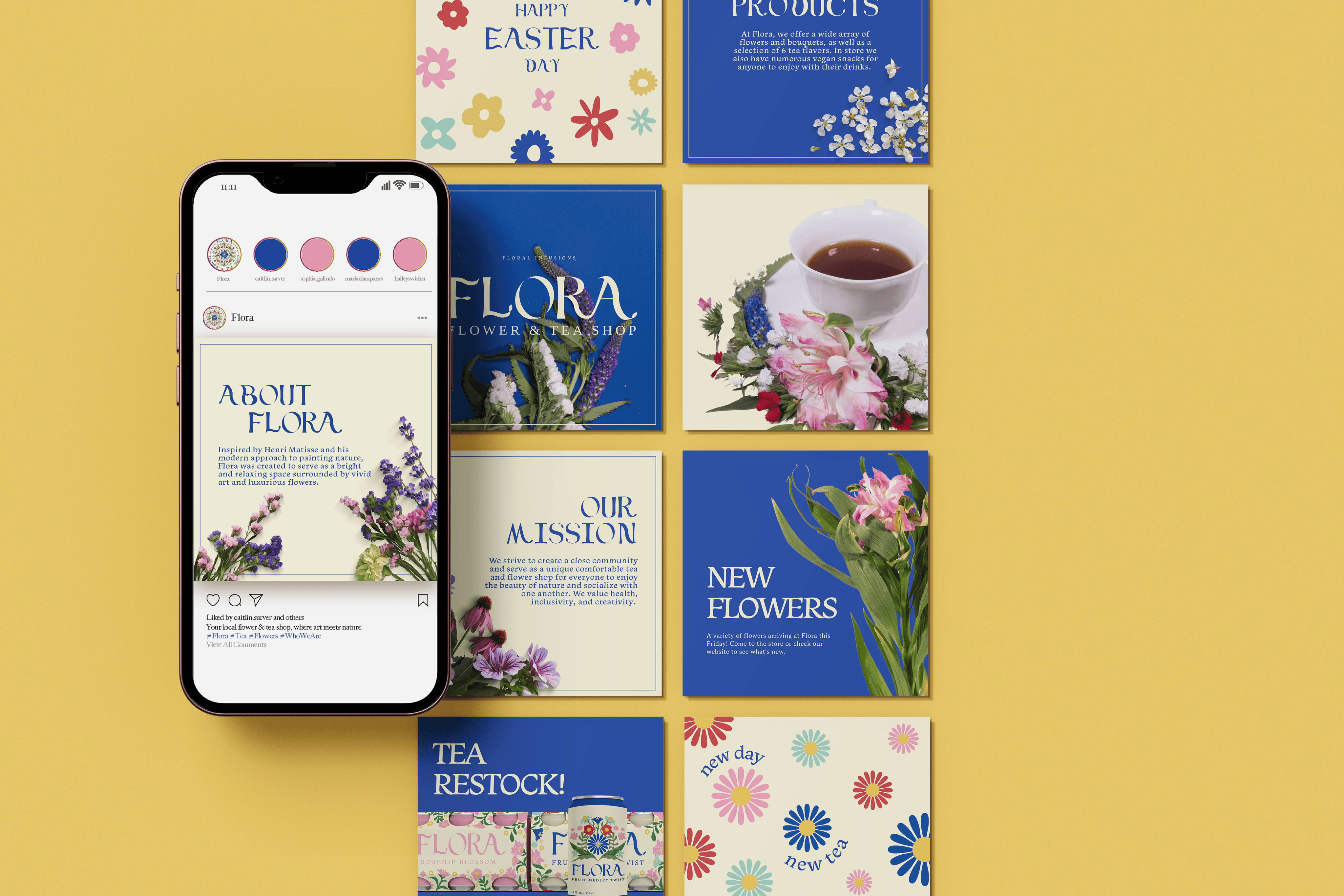
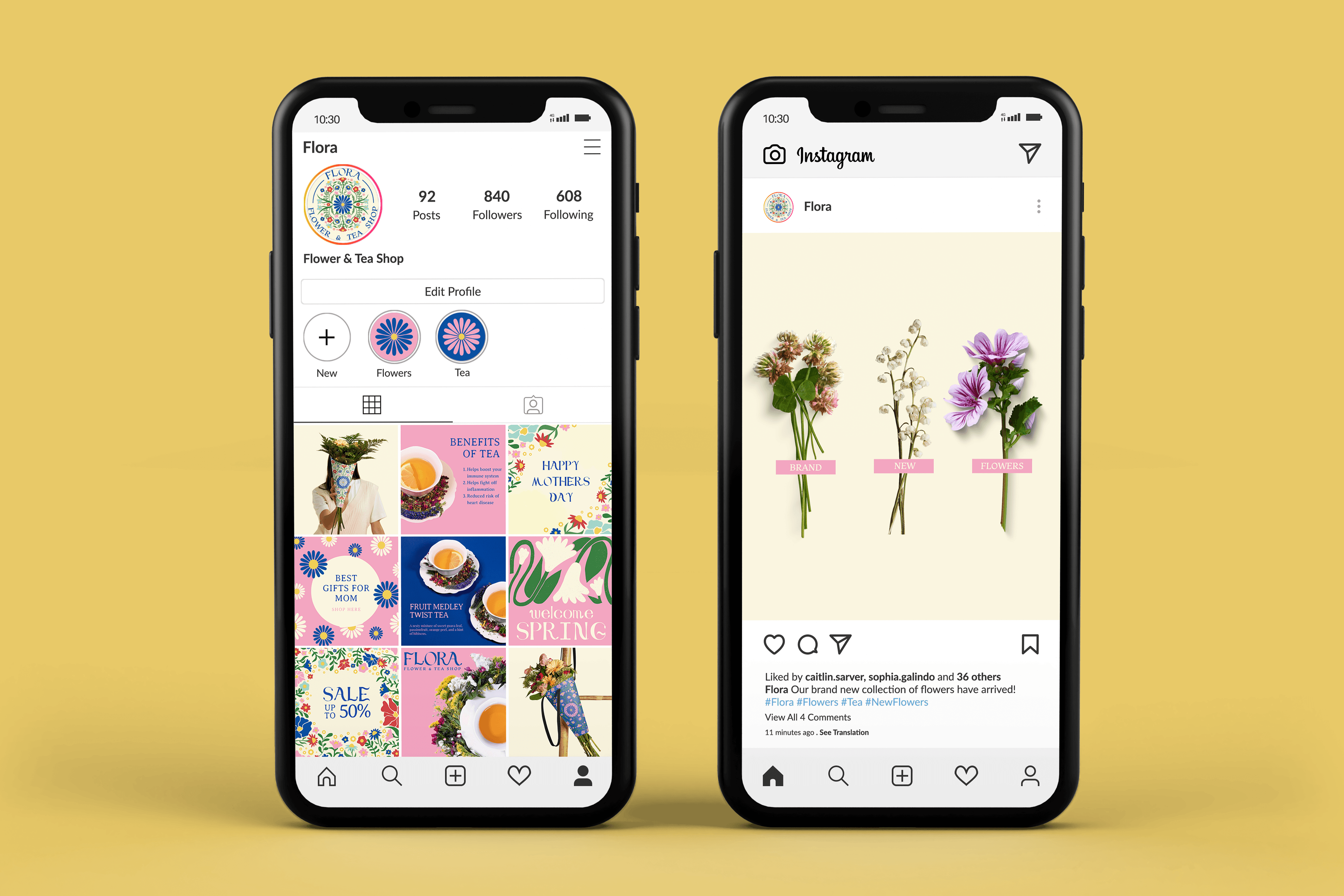
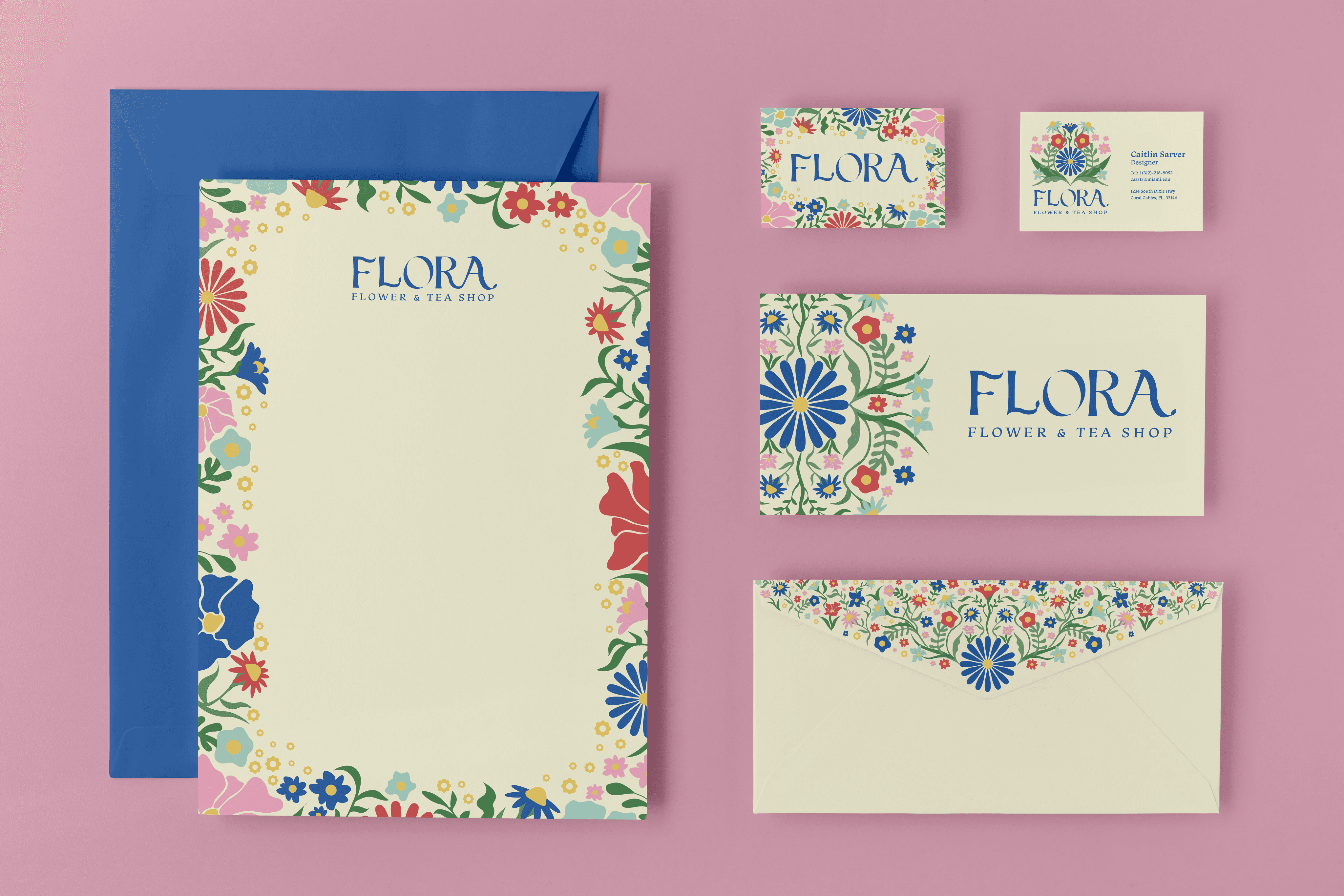
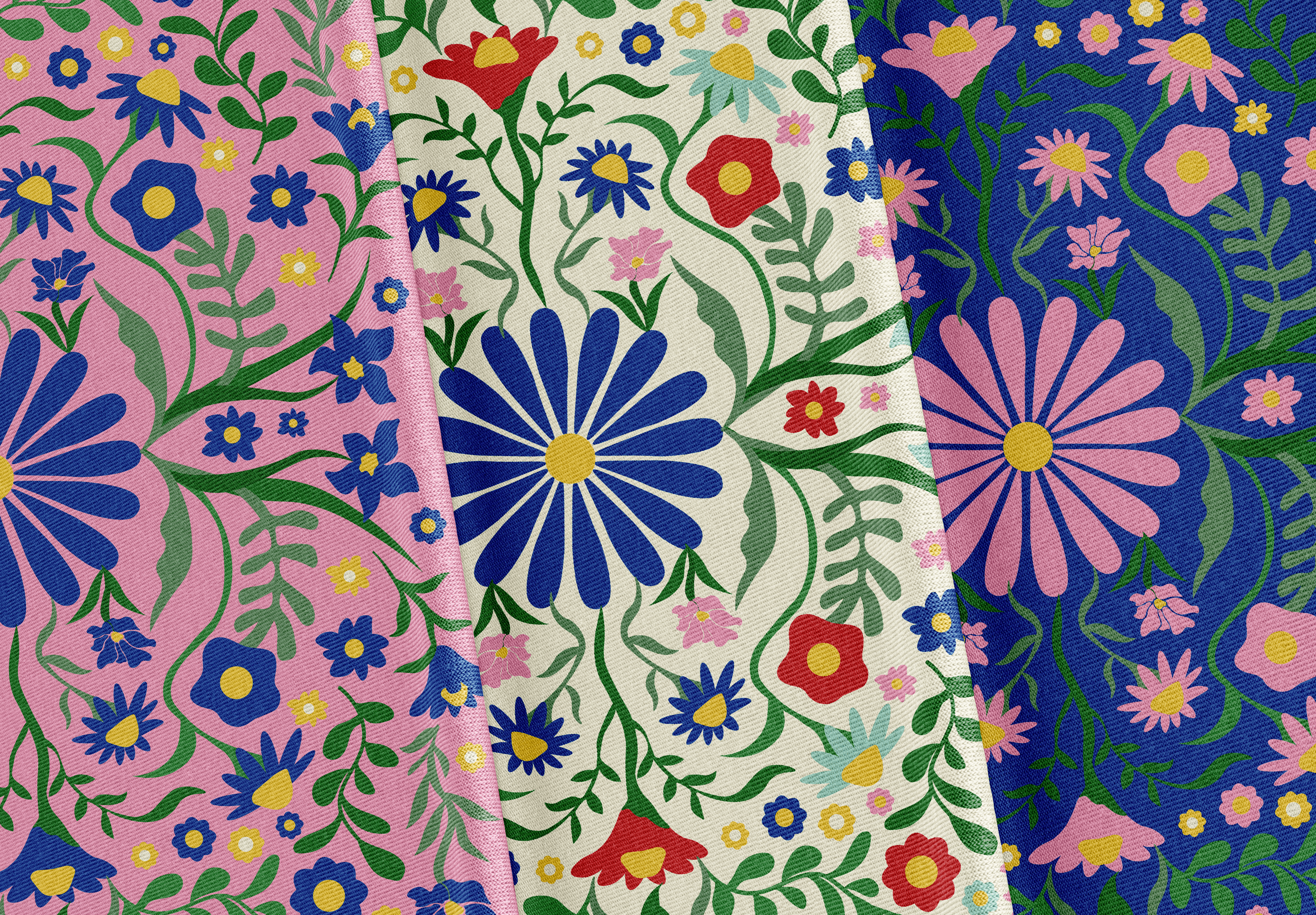
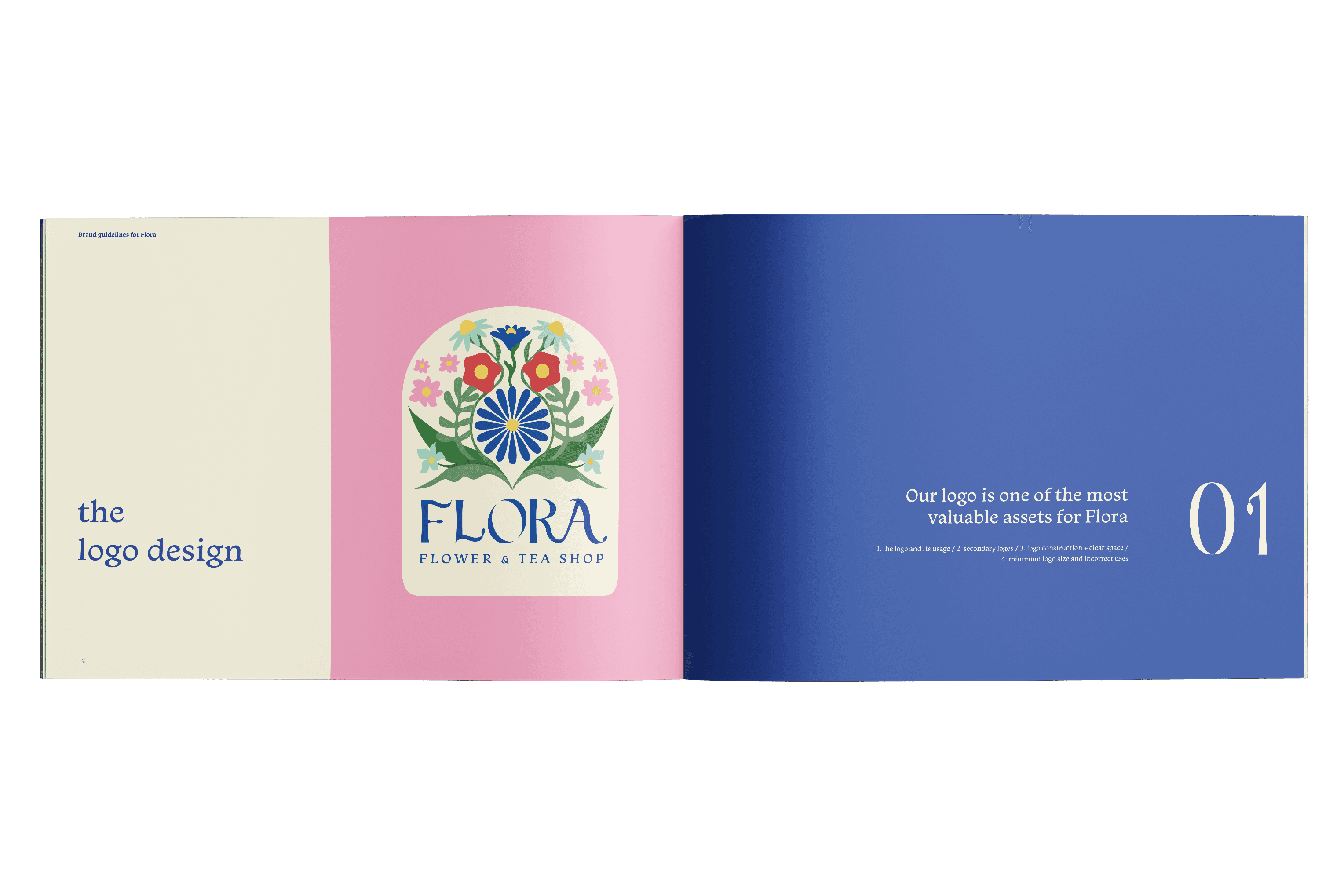
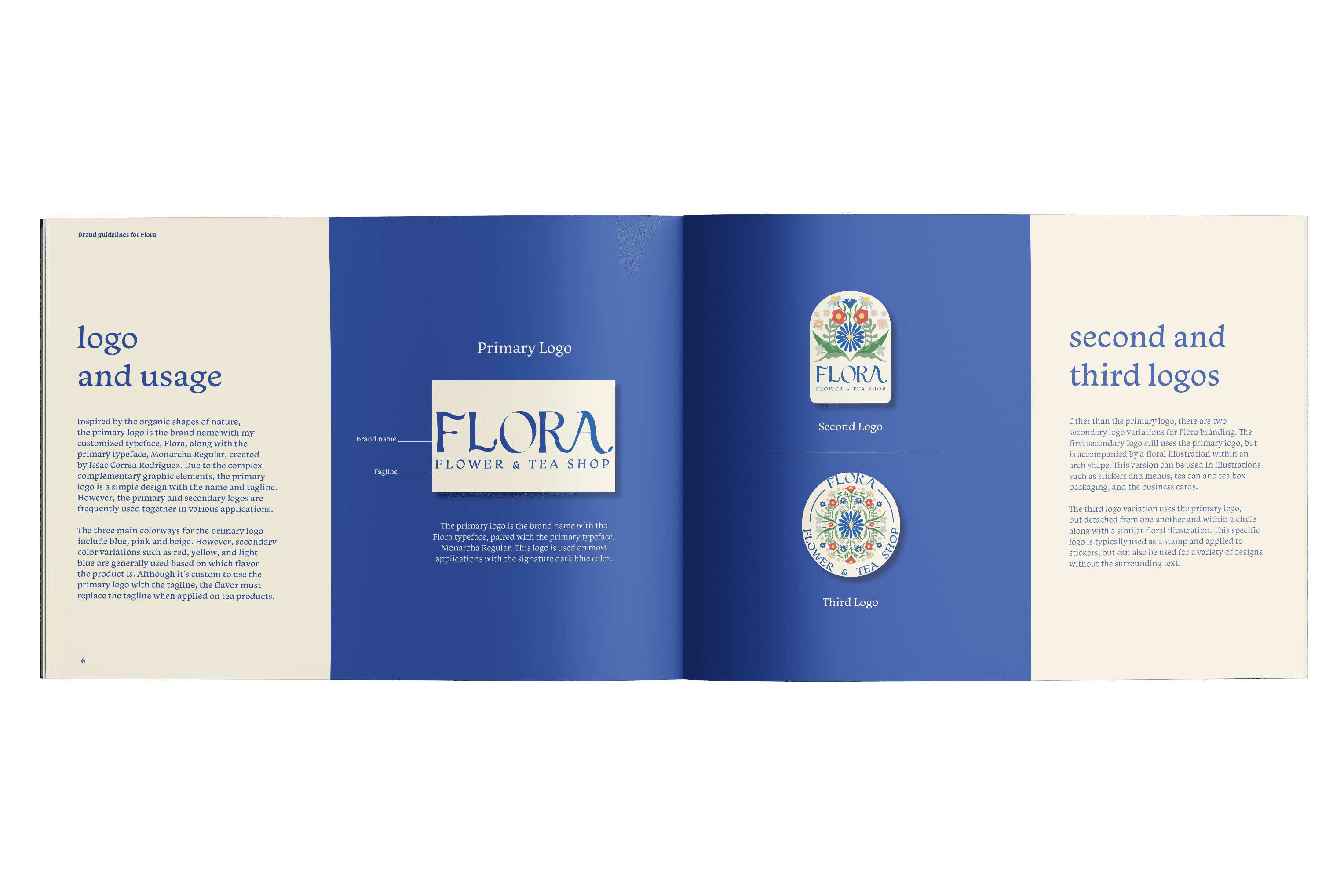
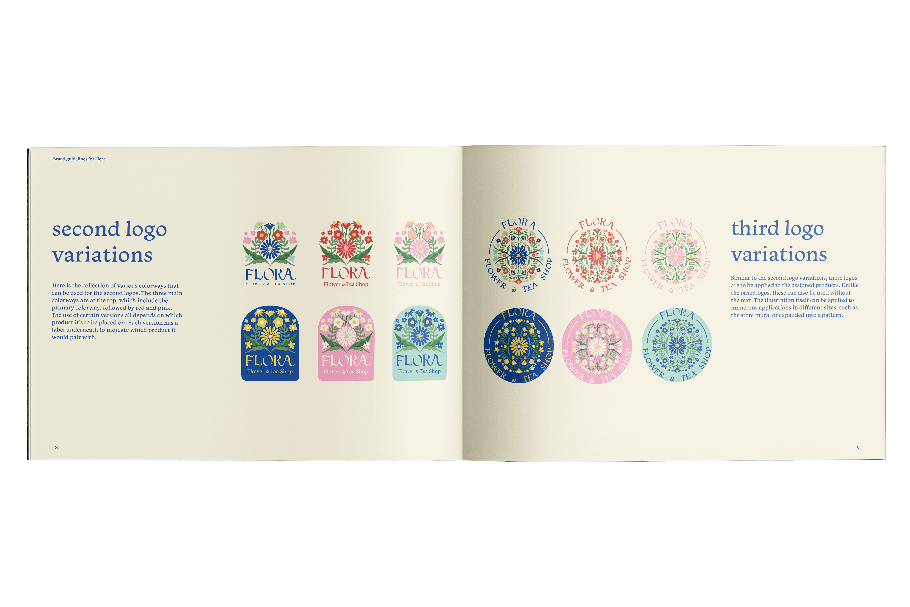
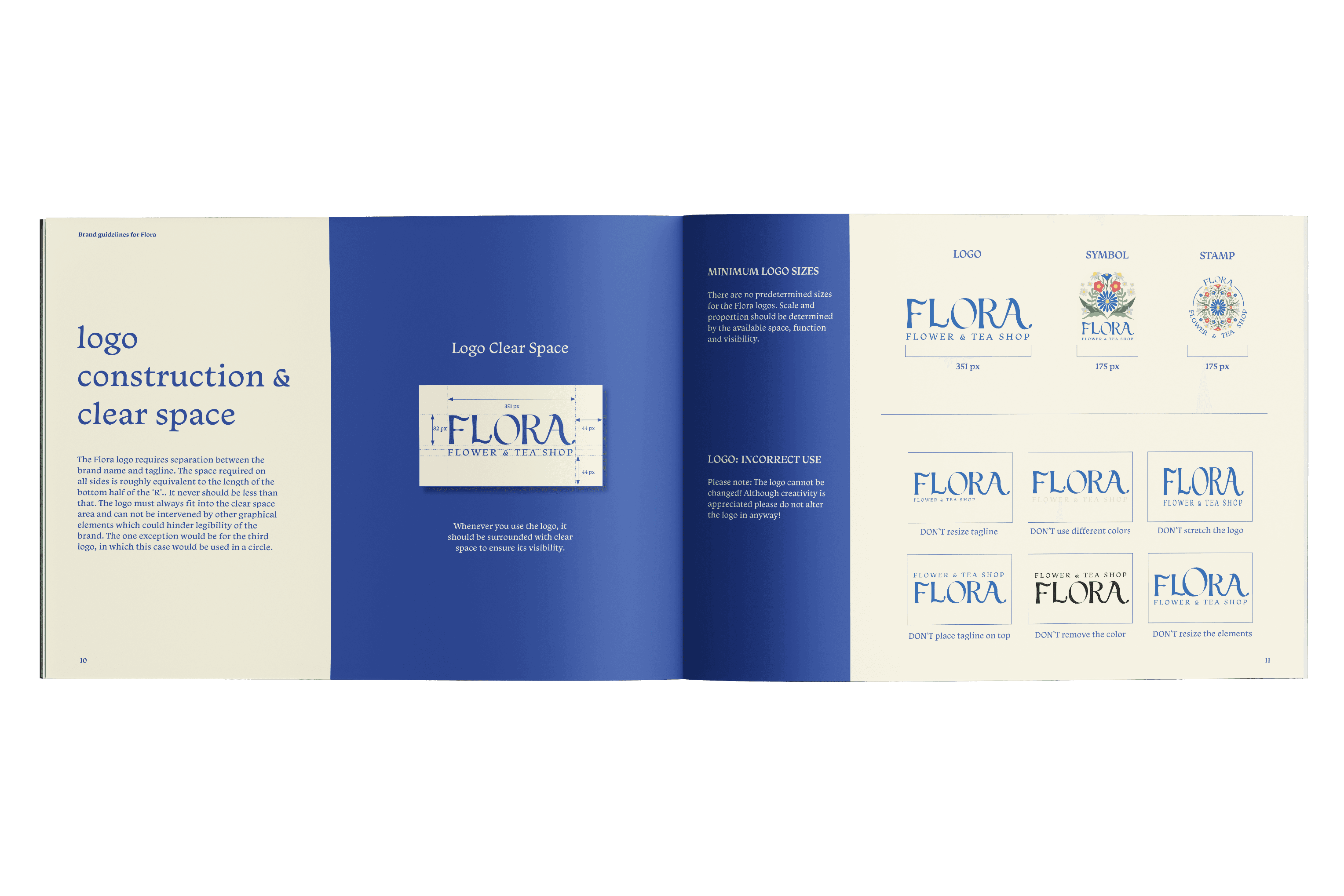
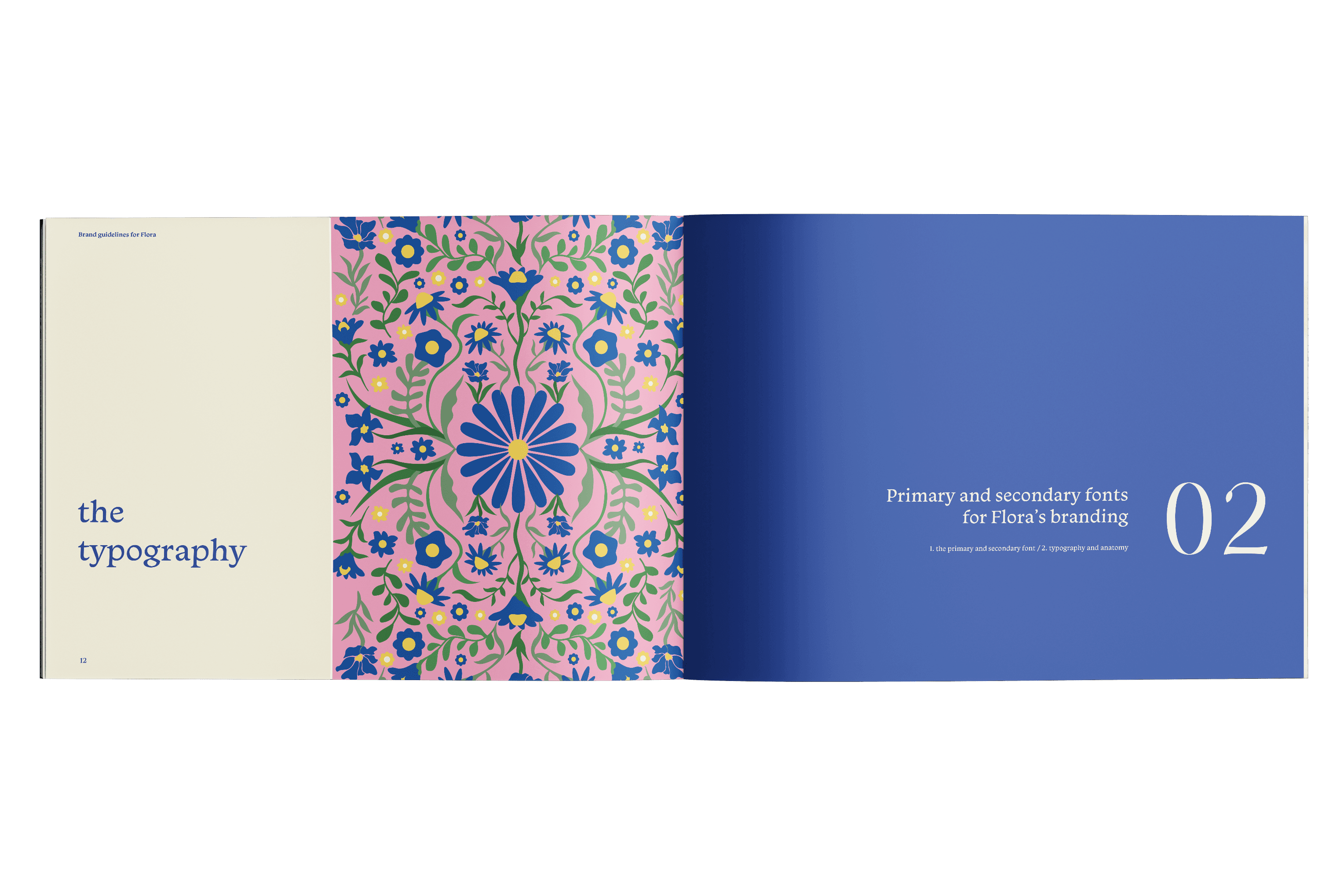
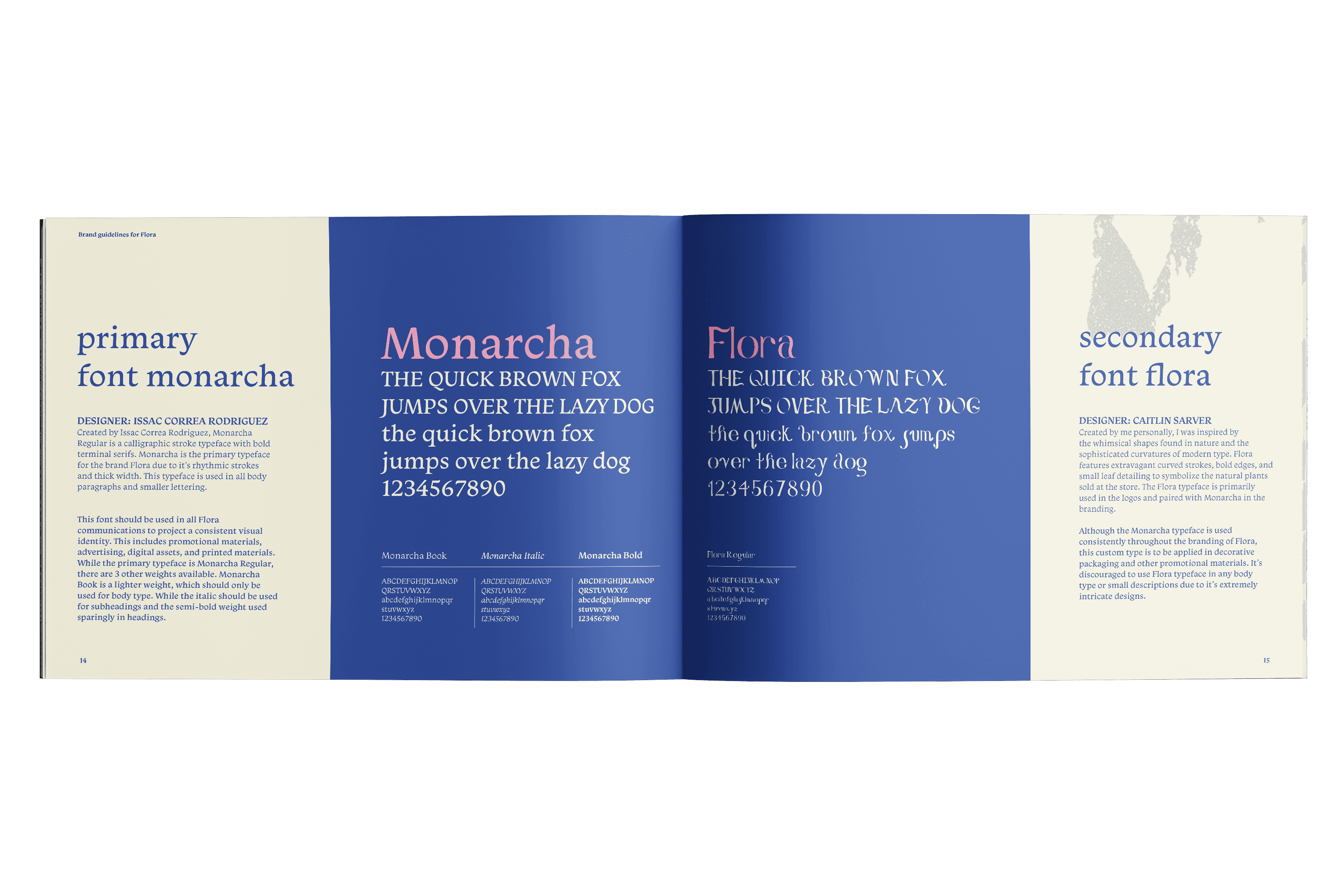
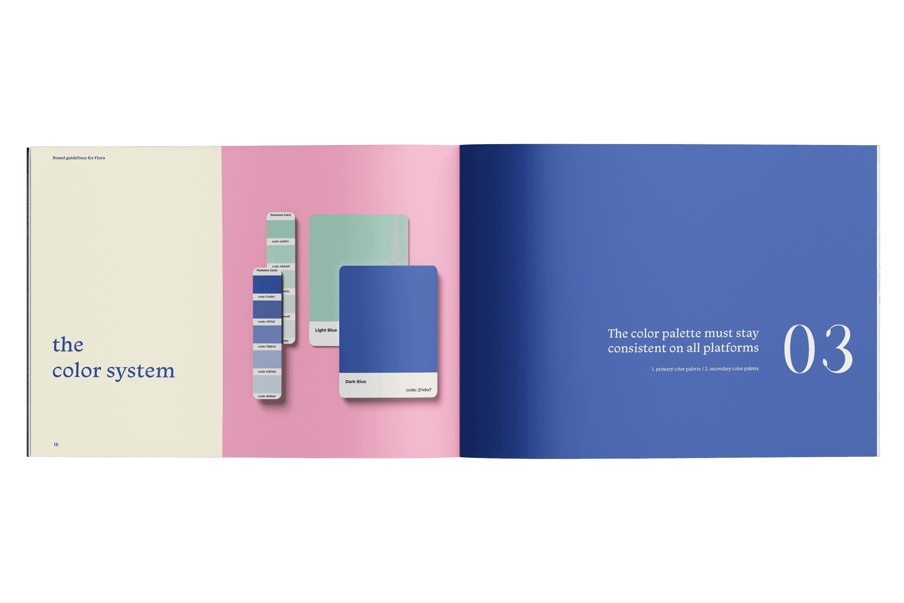
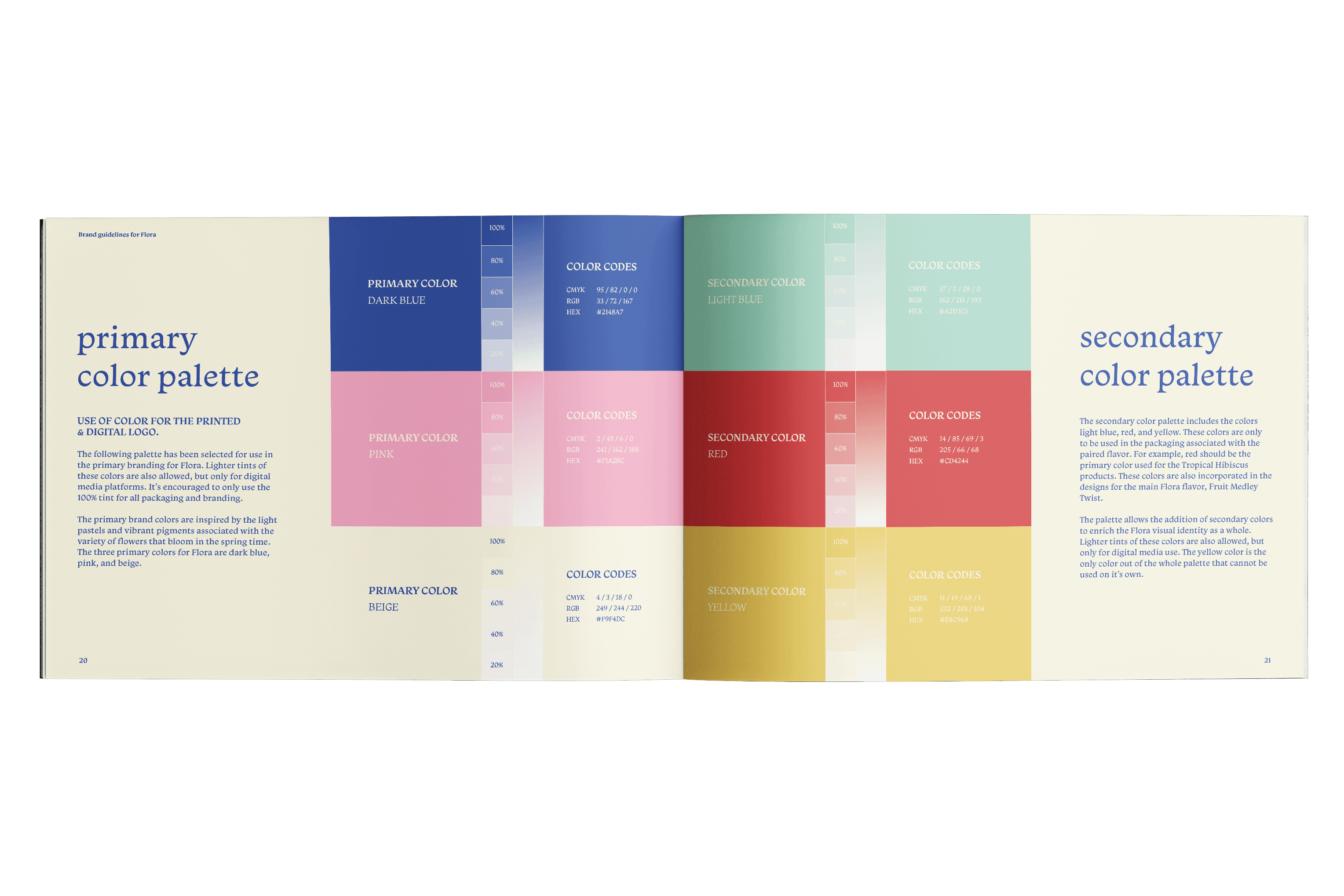
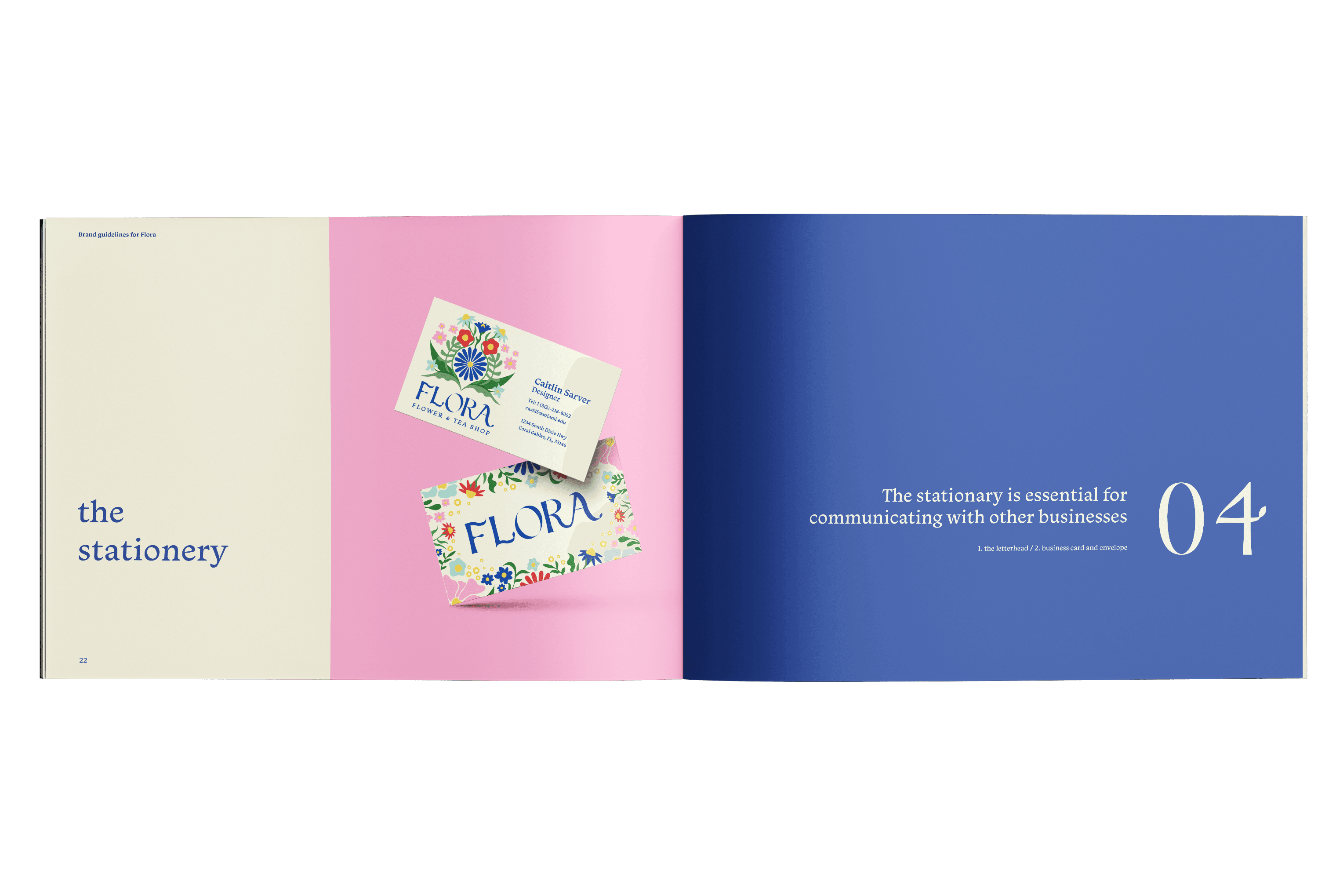
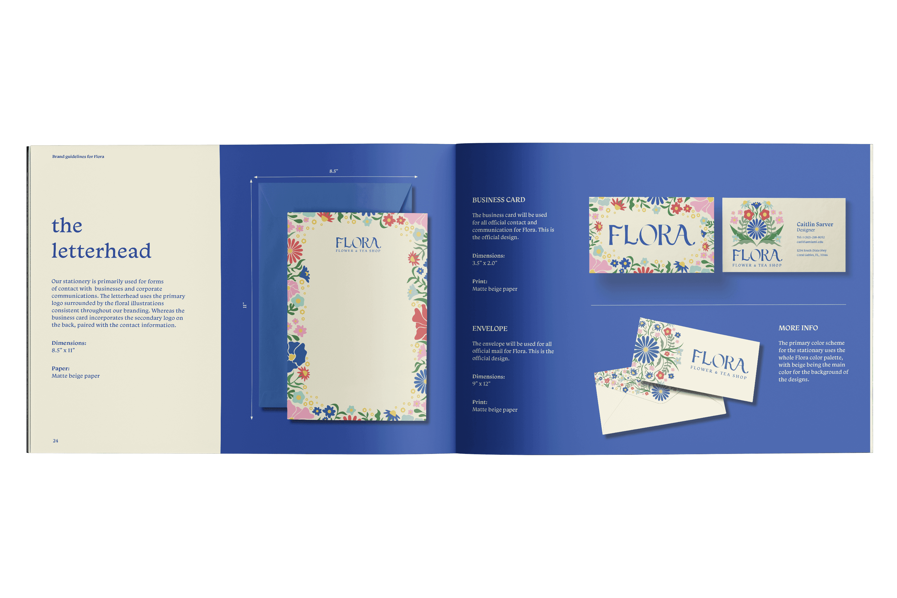
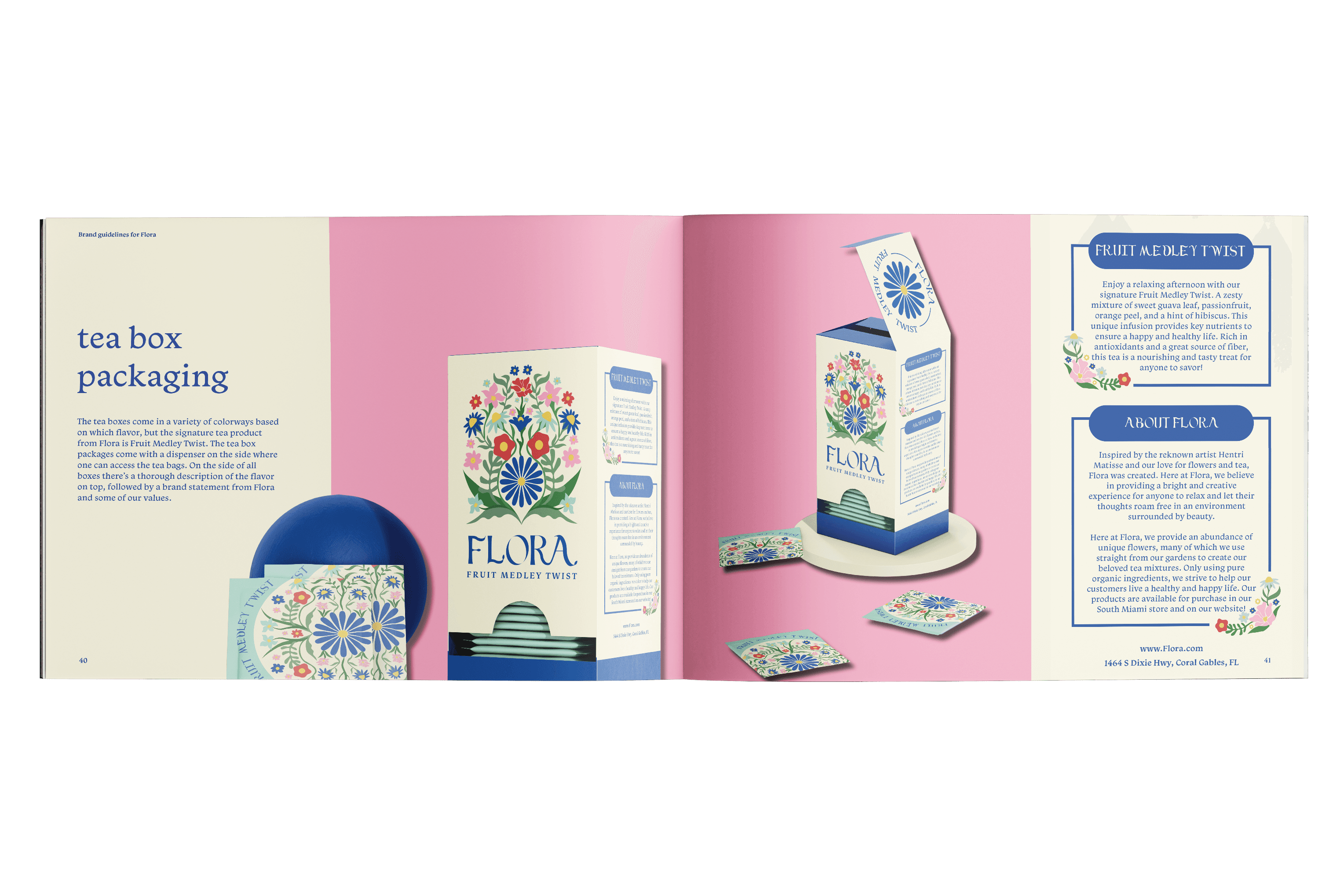
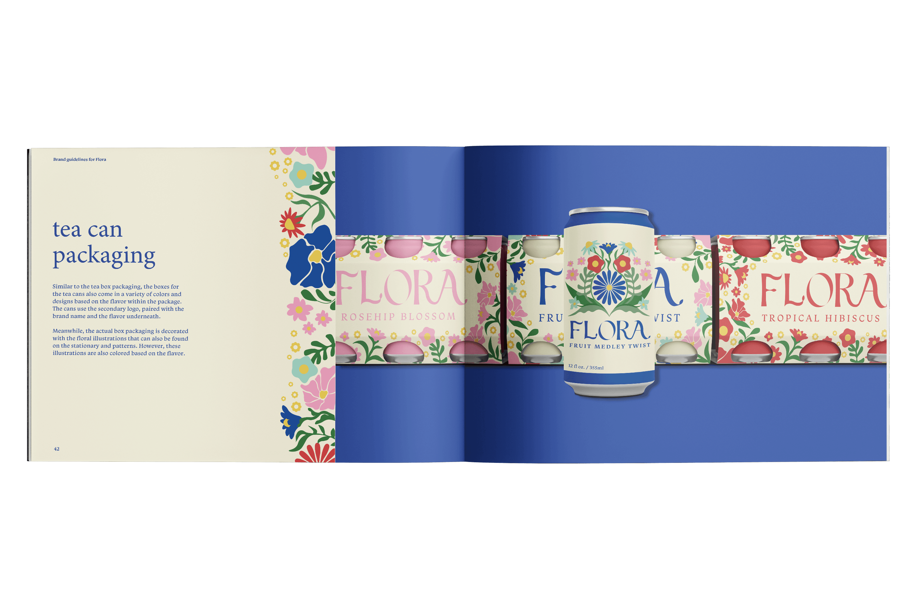
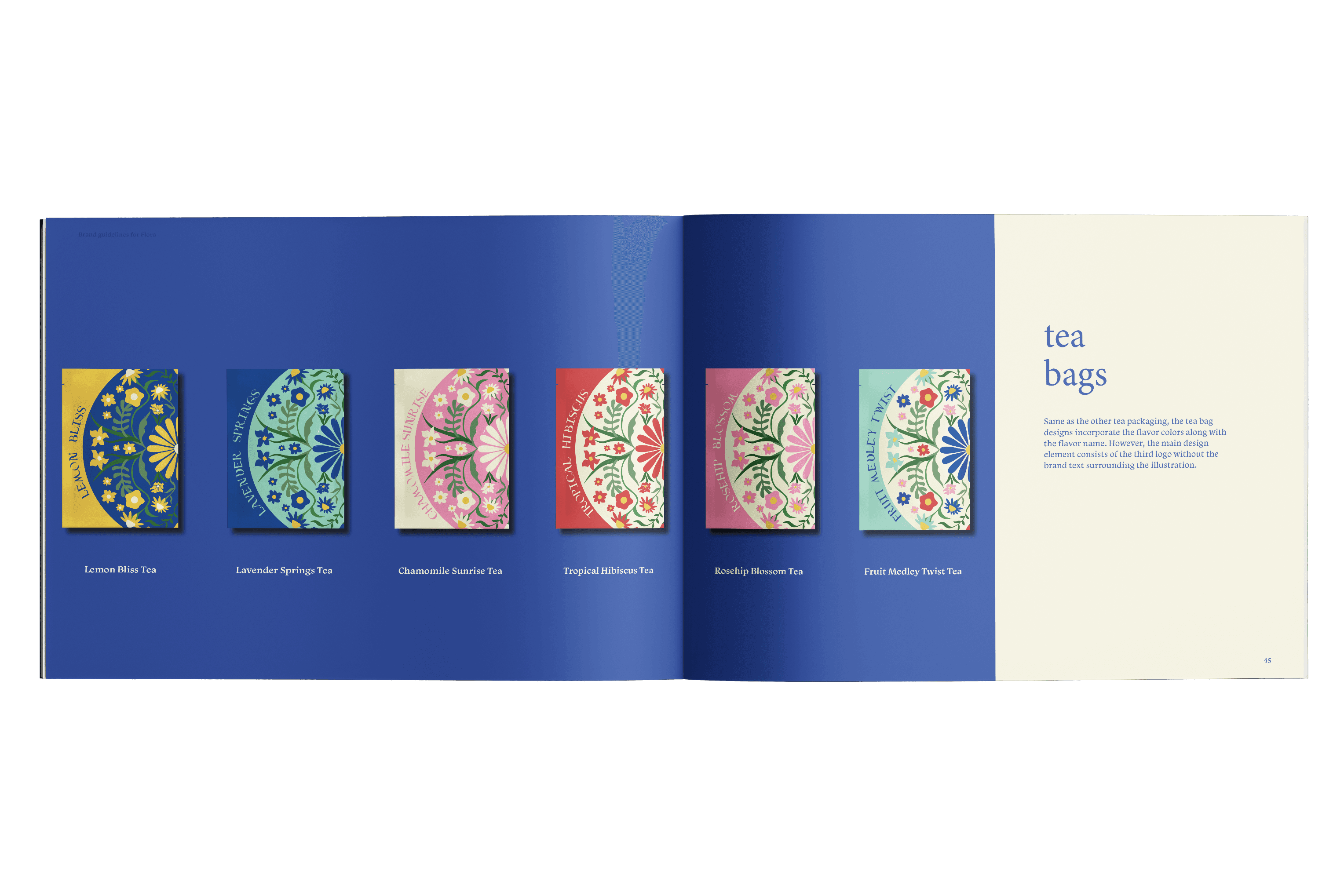
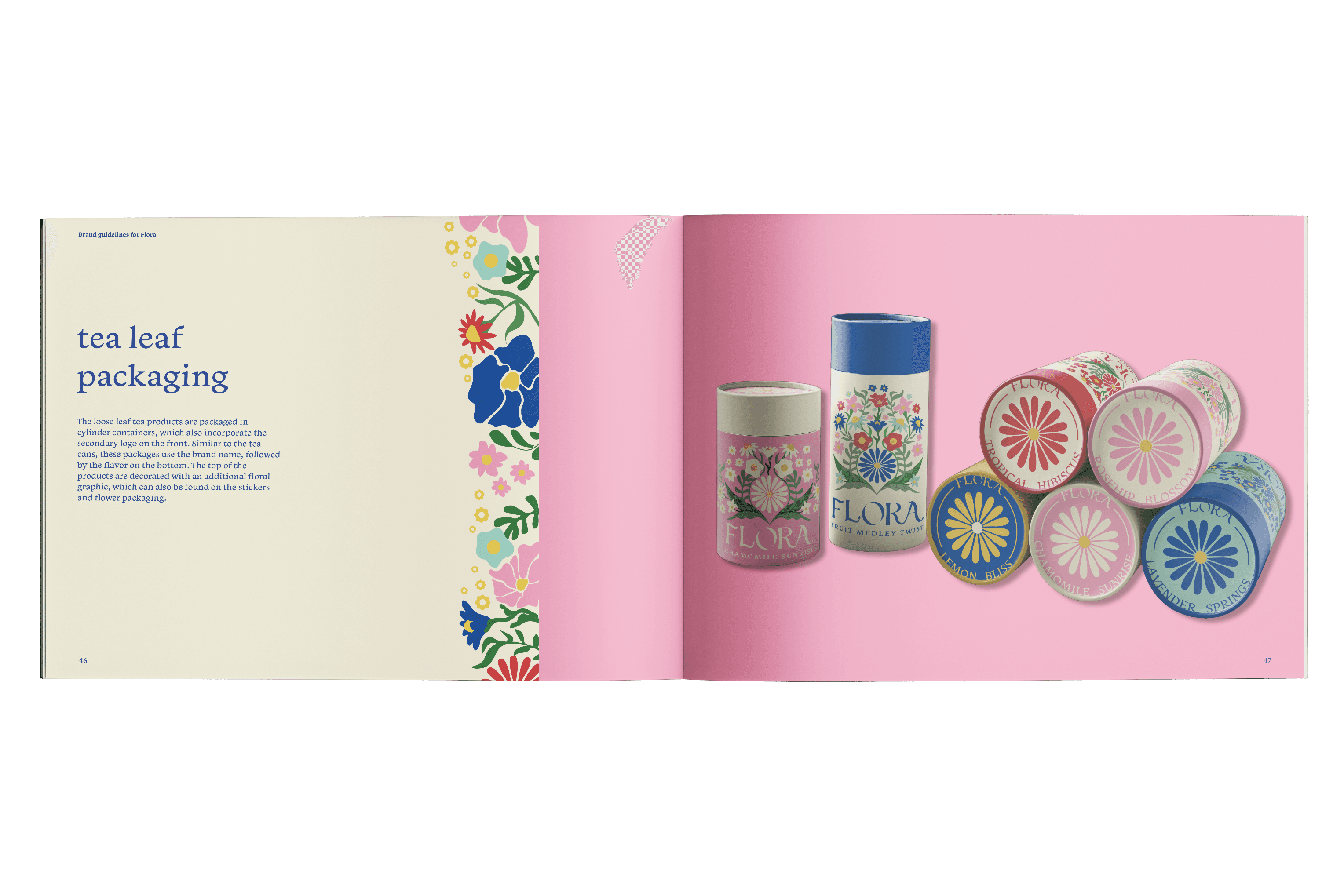
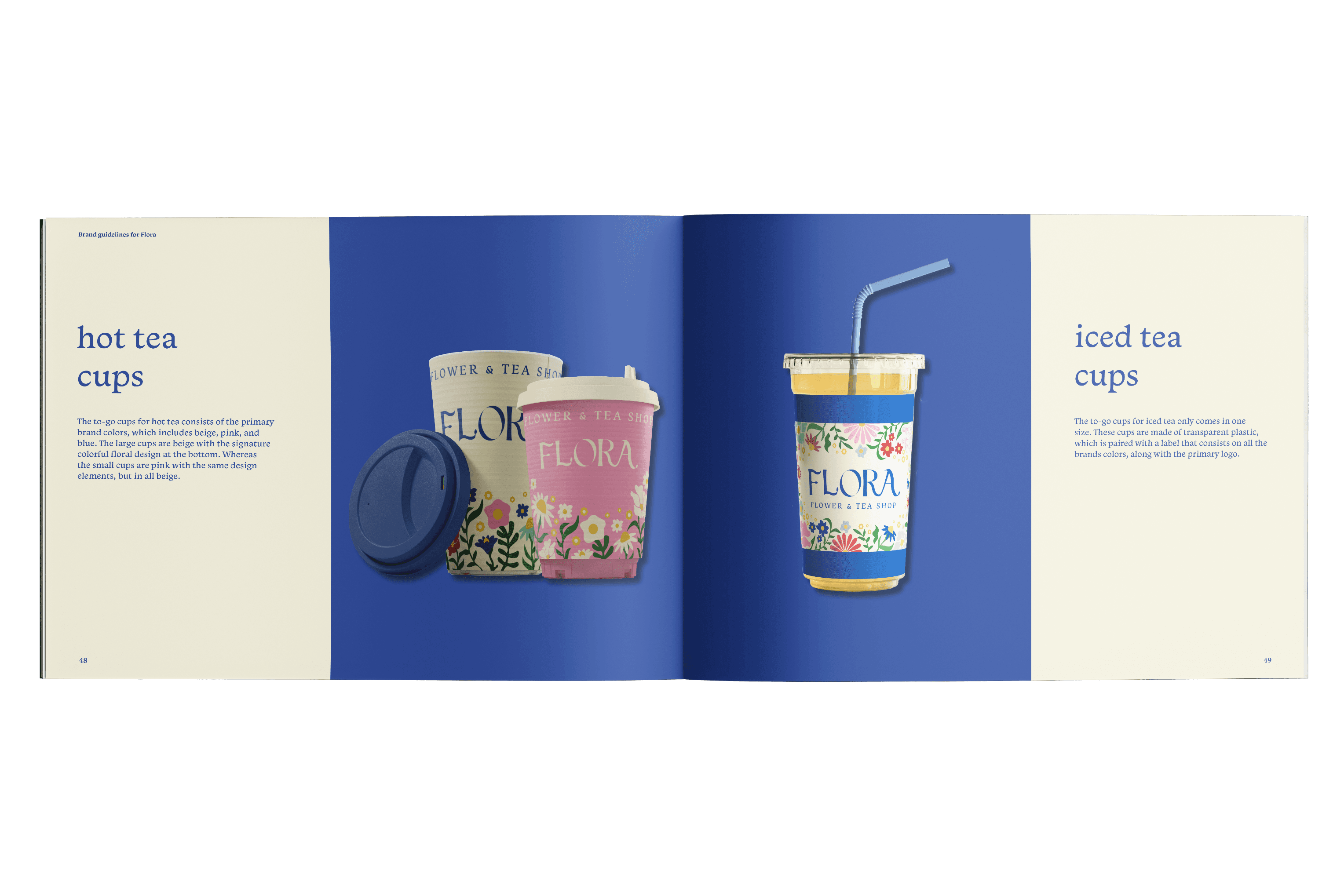
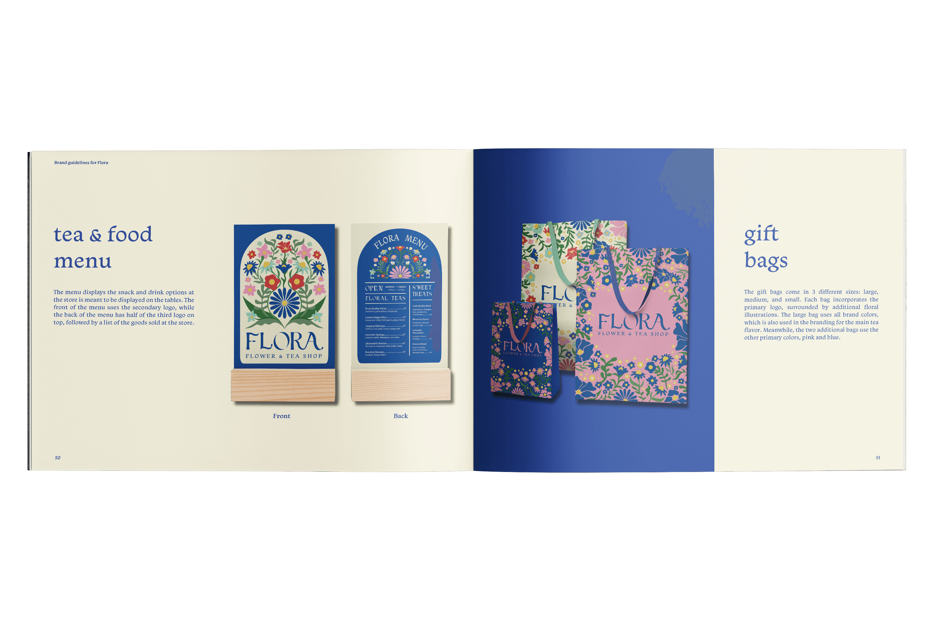
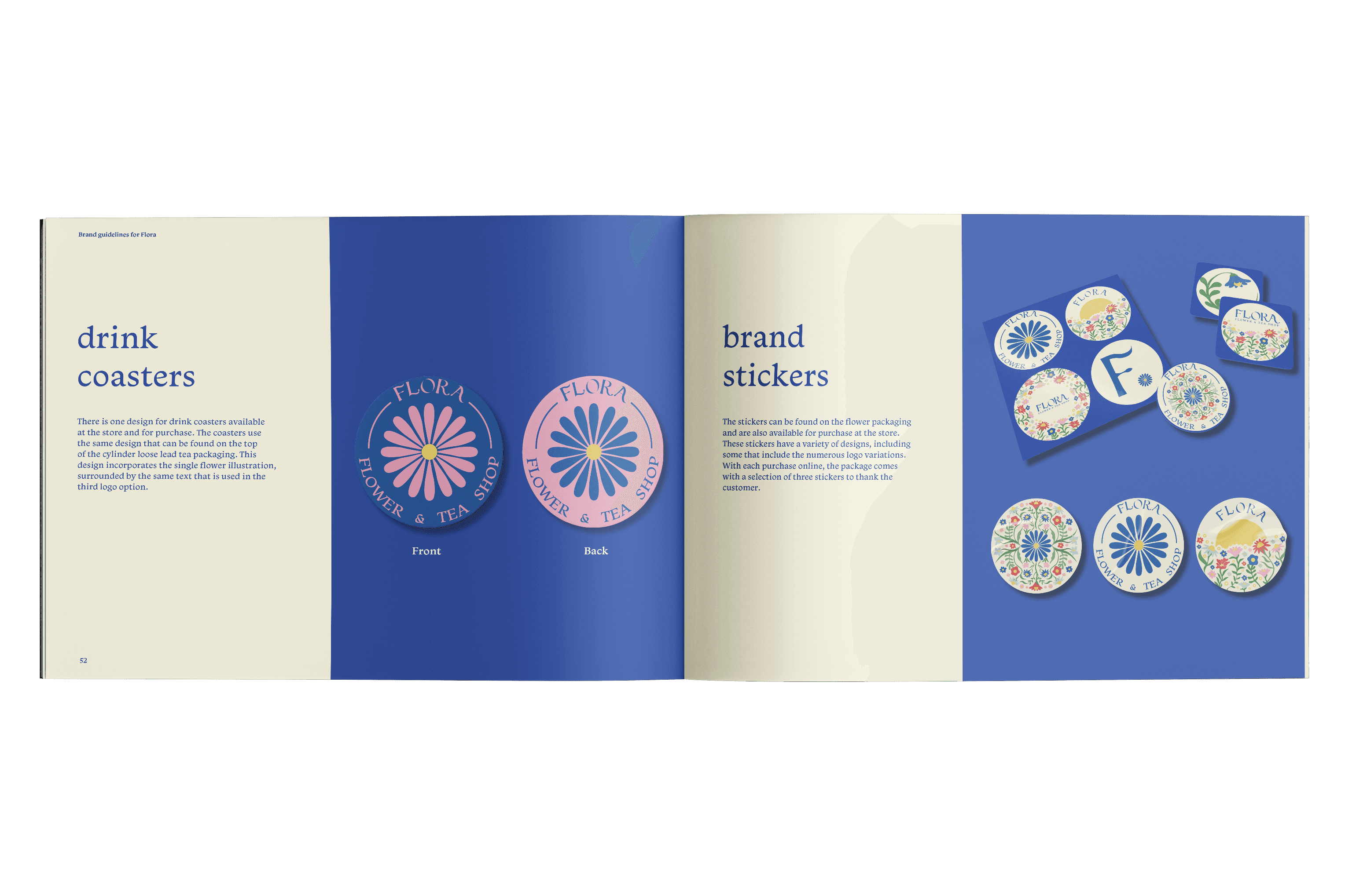
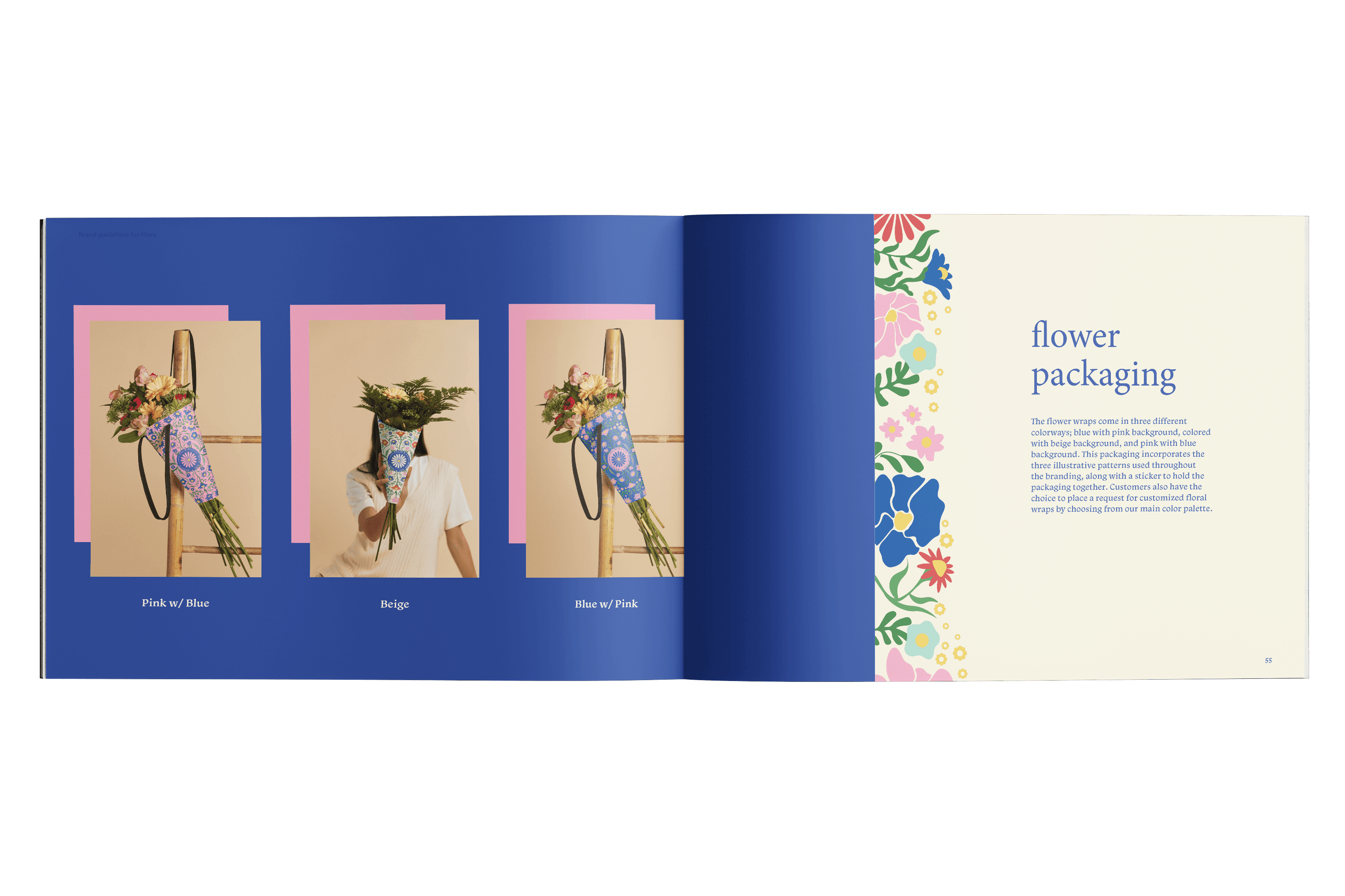
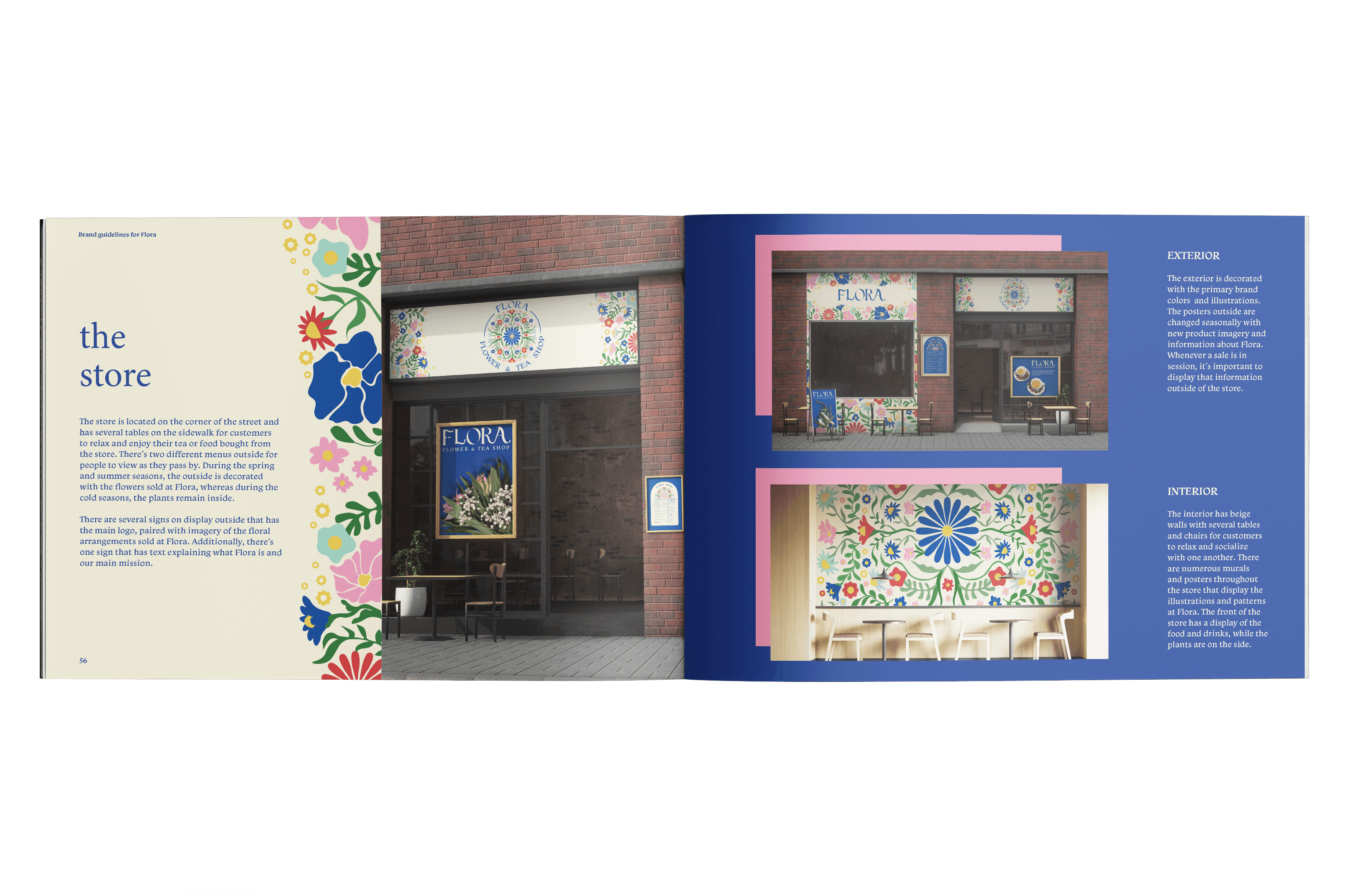
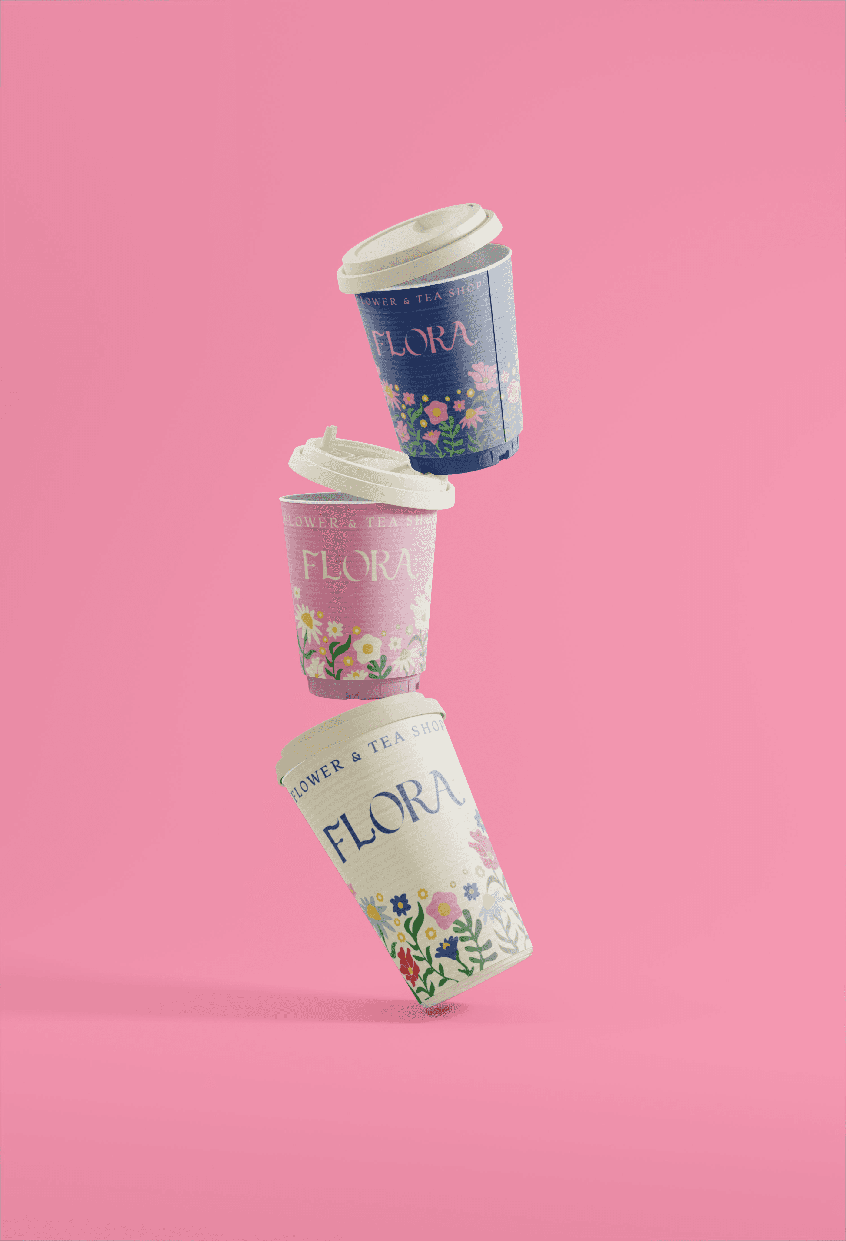
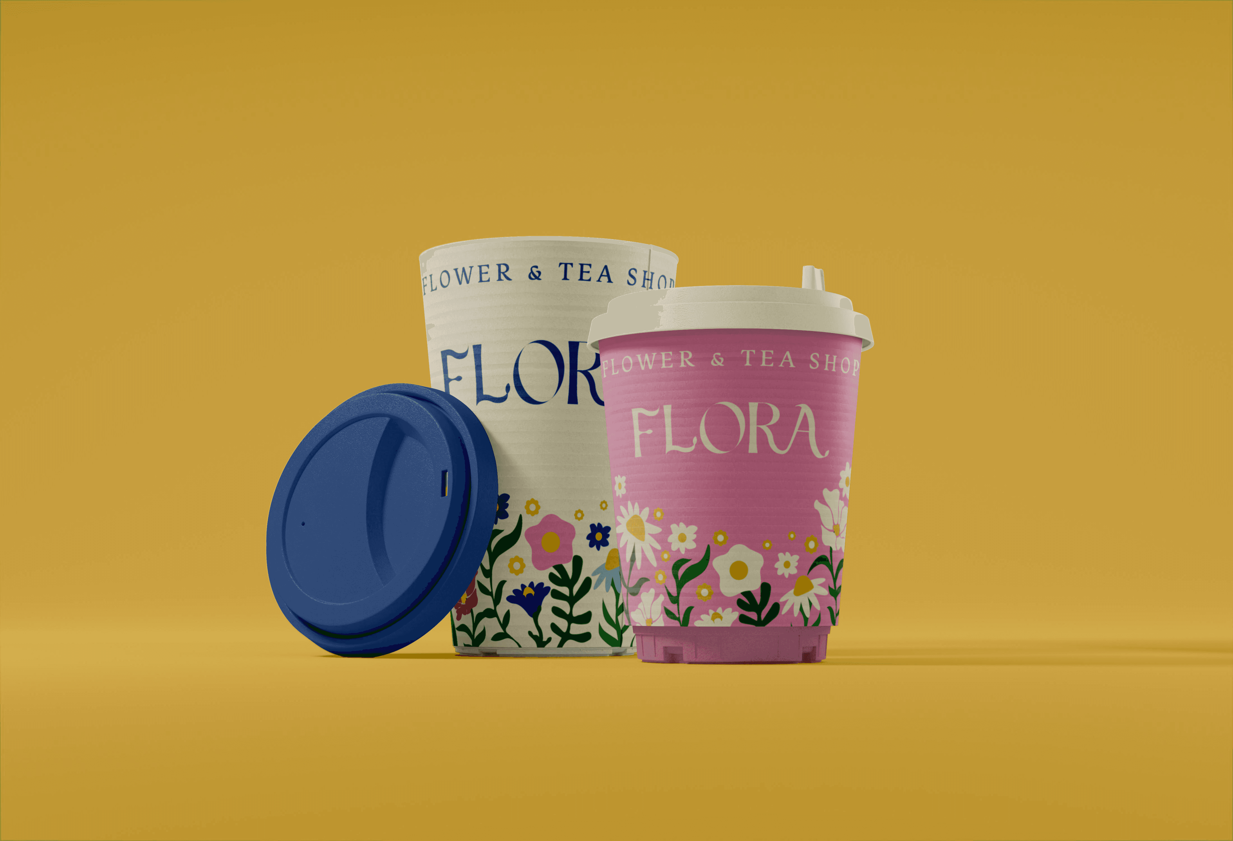
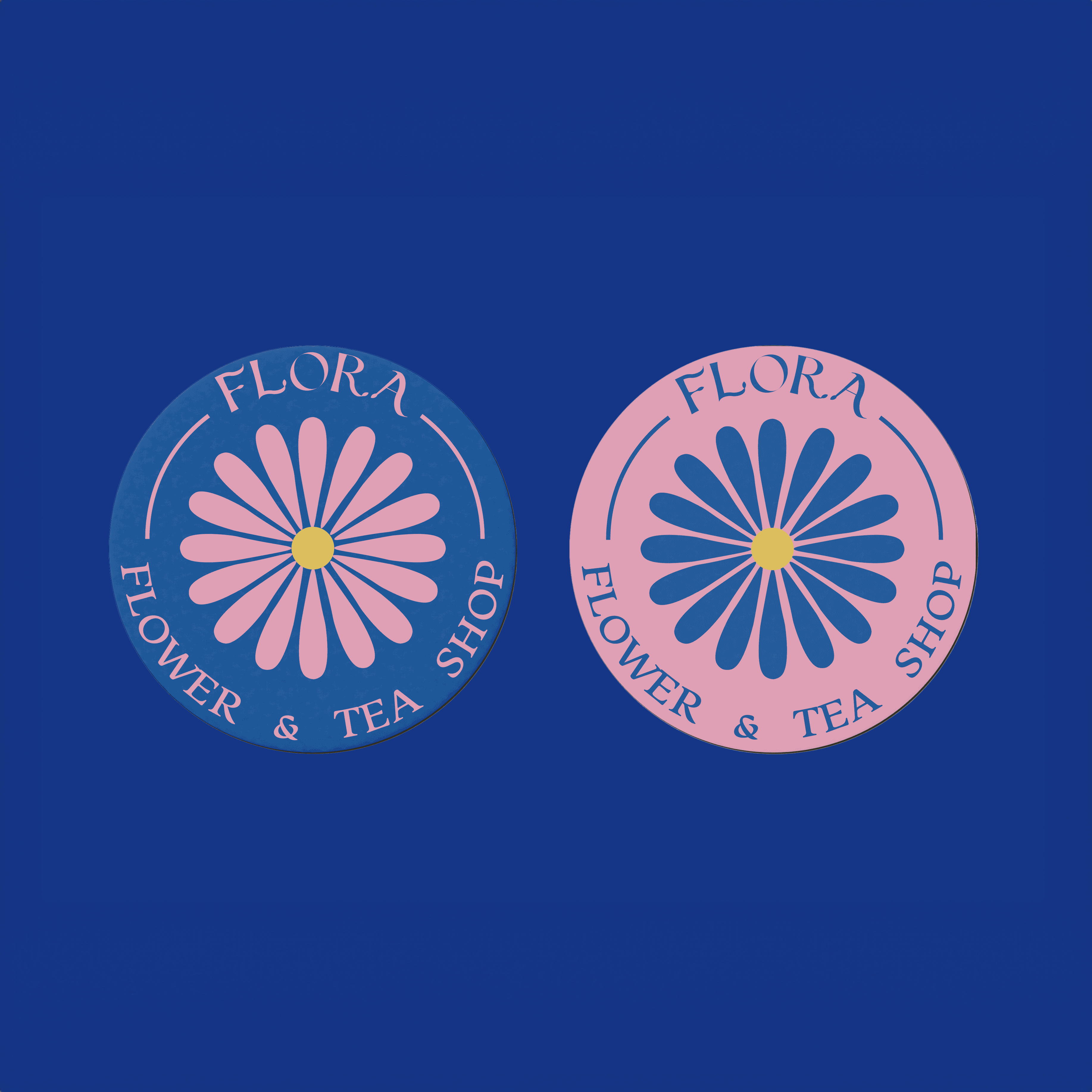
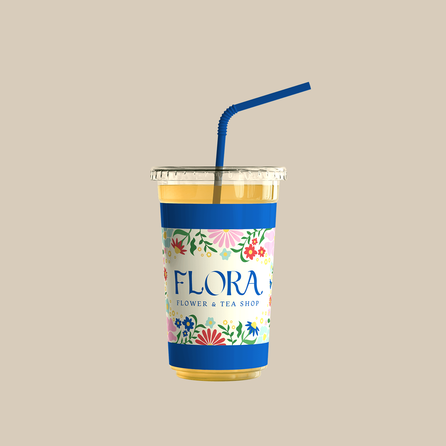
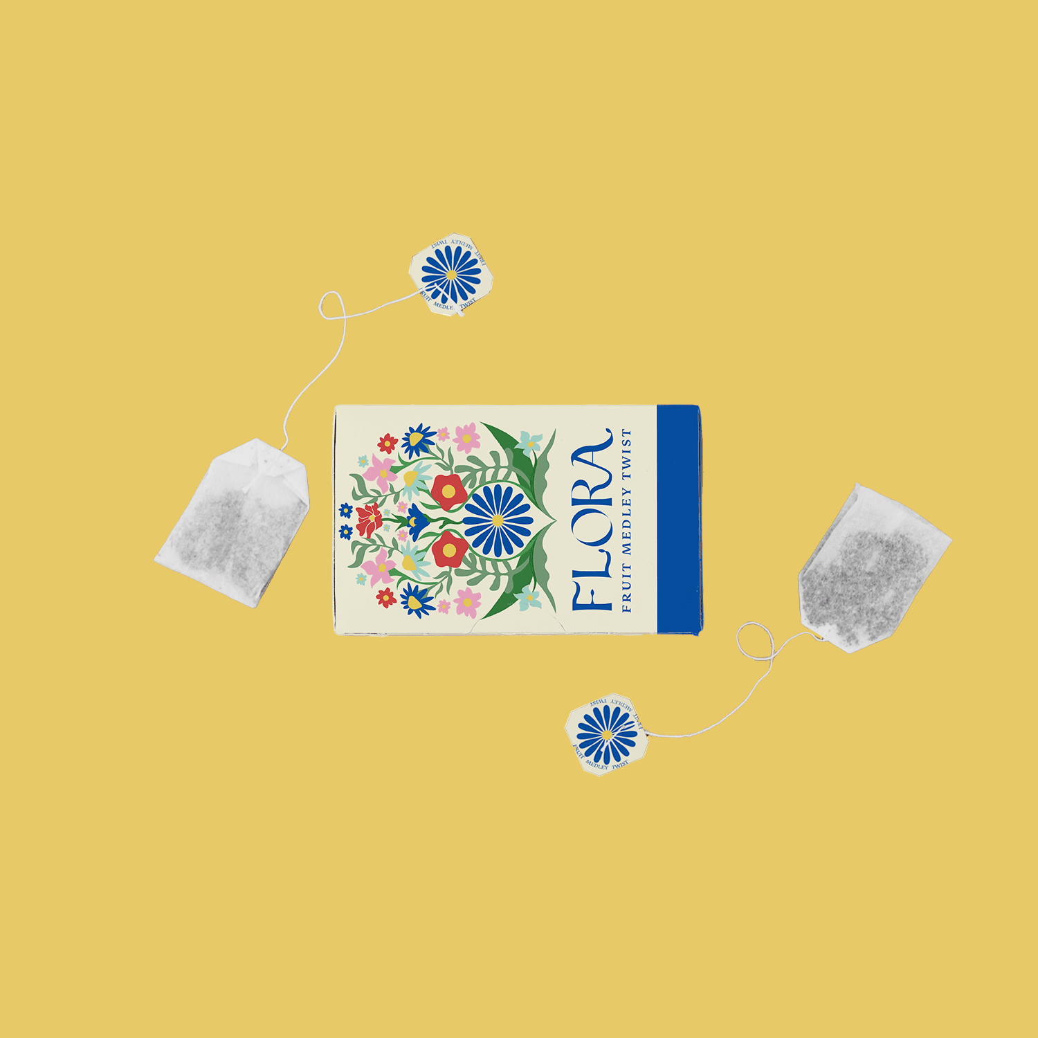
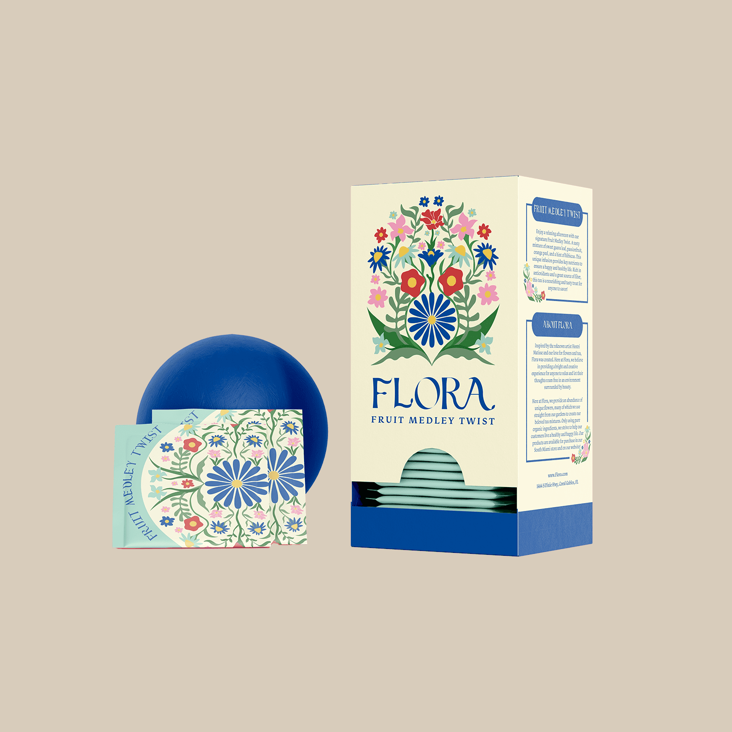
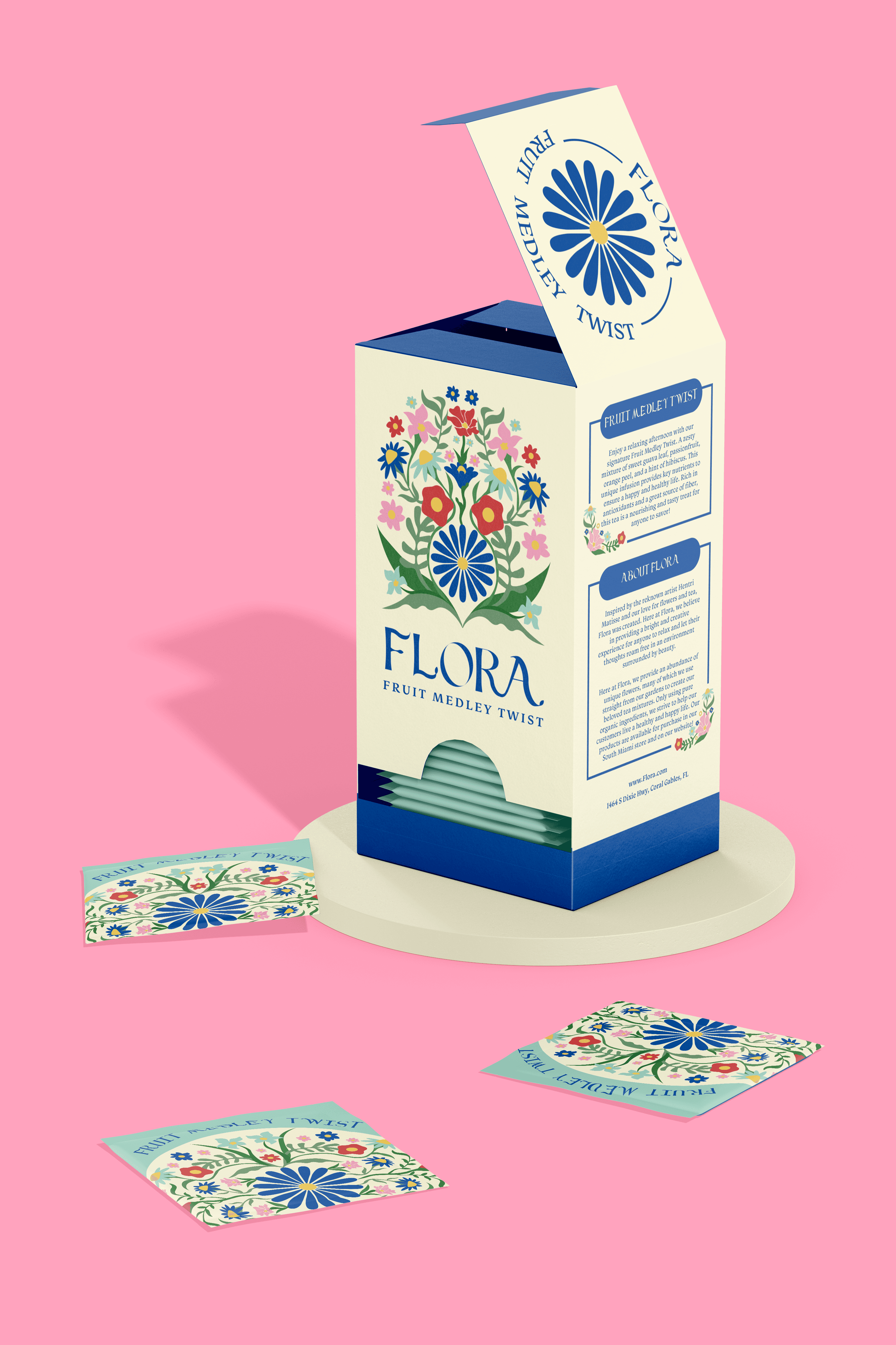
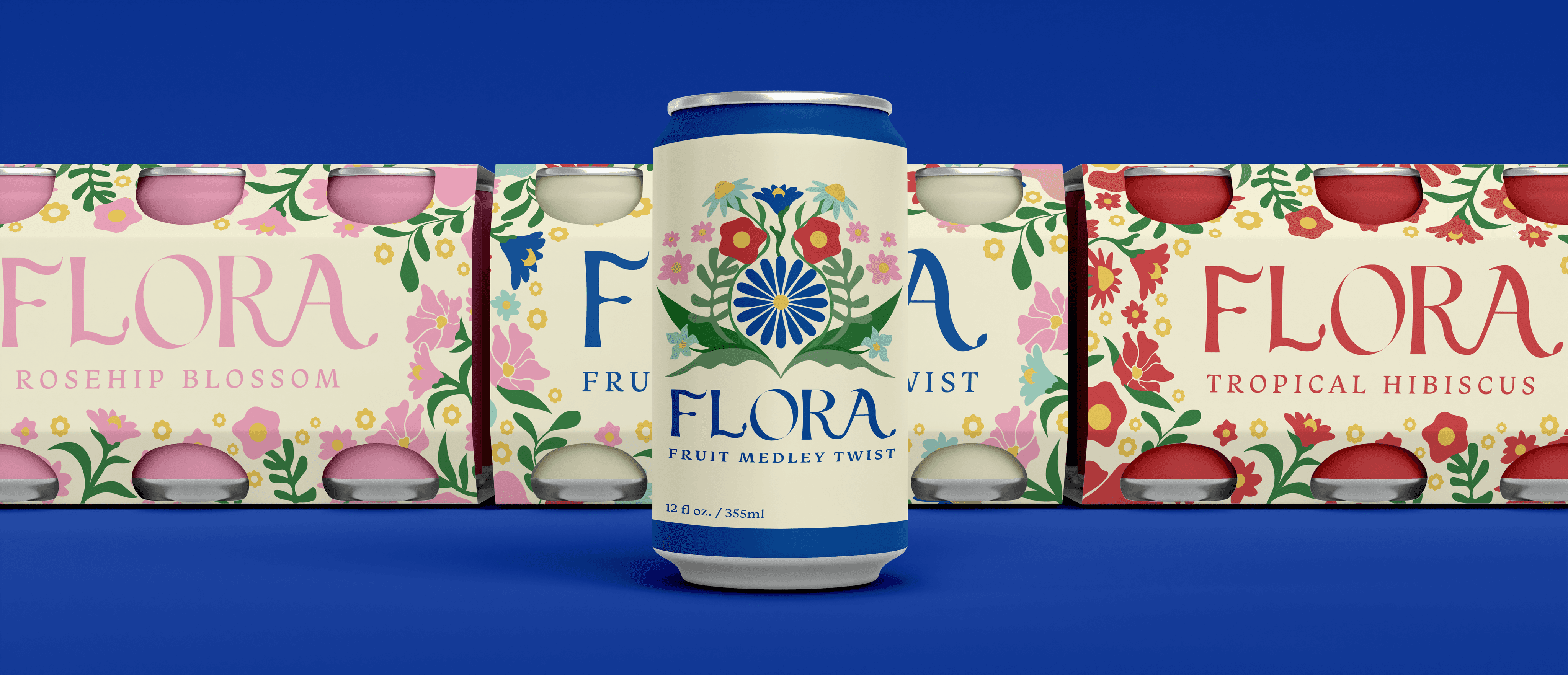
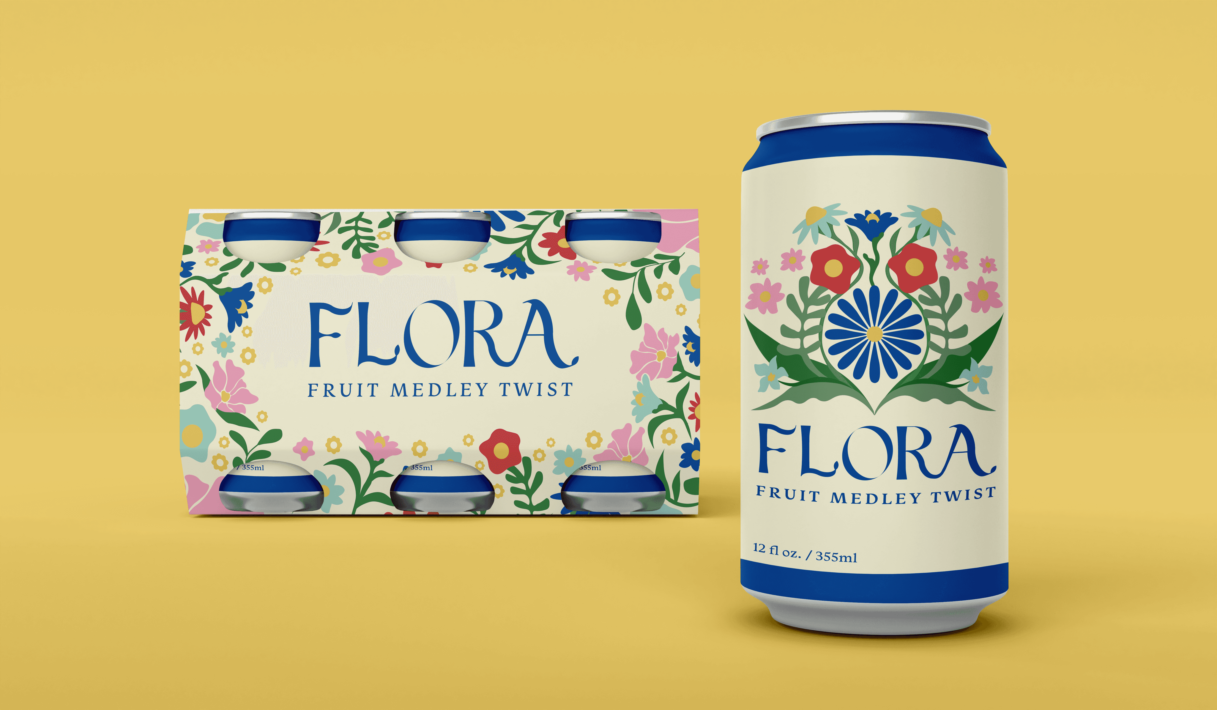
I created a logo system and custom typeface inspired by natural forms and modern elegance, paired with Monarcha for readability. The branding was applied to packaging such as tea boxes, tins, flower bags, and coasters, with each flavor featuring a unique color within a cohesive beige, pink, and dark blue palette. For social media, I developed a visual strategy combining photography, graphics, and content to engage the community and promote events.
I created a logo system and custom typeface inspired by natural forms and modern elegance, paired with Monarcha for readability. The branding was applied to packaging such as tea boxes, tins, flower bags, and coasters, with each flavor featuring a unique color within a cohesive beige, pink, and dark blue palette. For social media, I developed a visual strategy combining photography, graphics, and content to engage the community and promote events.
The Result
The Result
The Result
The Result
Flora now exists as a vibrant and memorable brand experience that feels both elevated and heartfelt. The cohesive design system brought a sense of identity to every product and touchpoint, inviting customers into a world that celebrates creativity, comfort, and care in equal measure.
Flora now exists as a vibrant and memorable brand experience that feels both elevated and heartfelt. The cohesive design system brought a sense of identity to every product and touchpoint, inviting customers into a world that celebrates creativity, comfort, and care in equal measure.